Our Process
1. Designing a patient app that holds patients through the hardest weeks
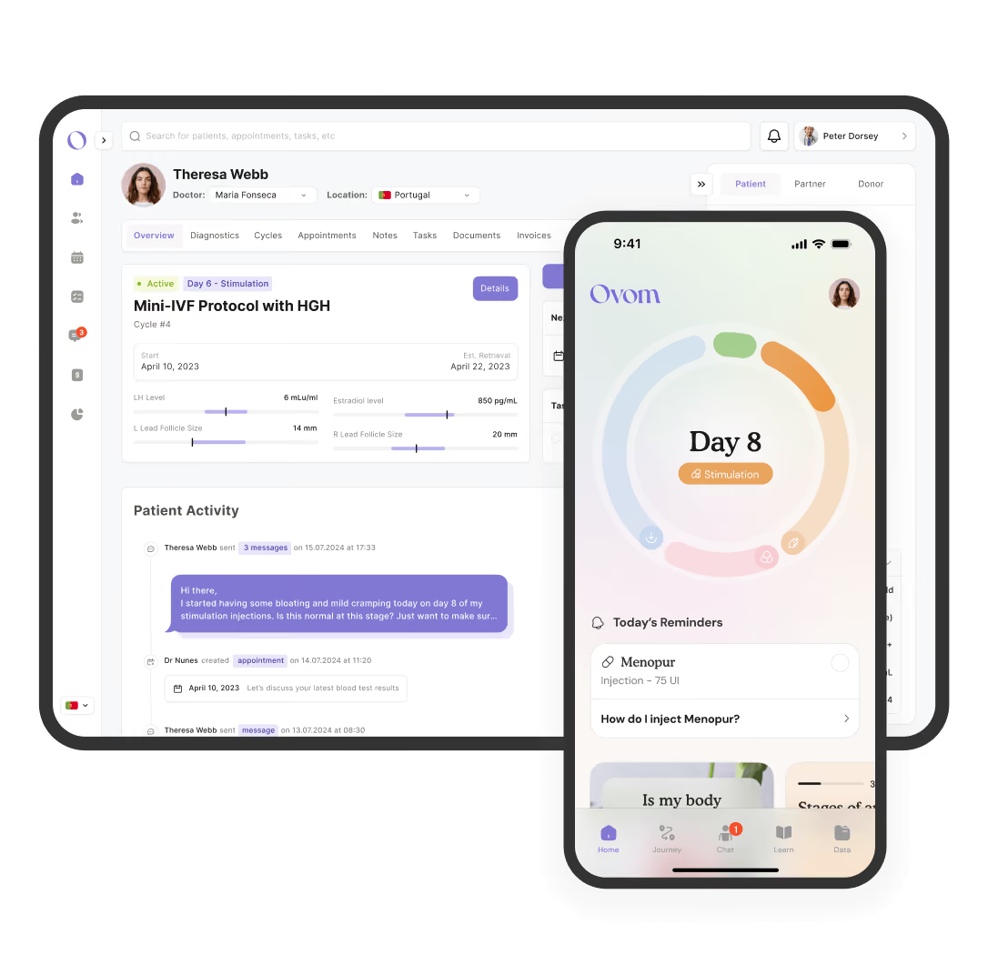
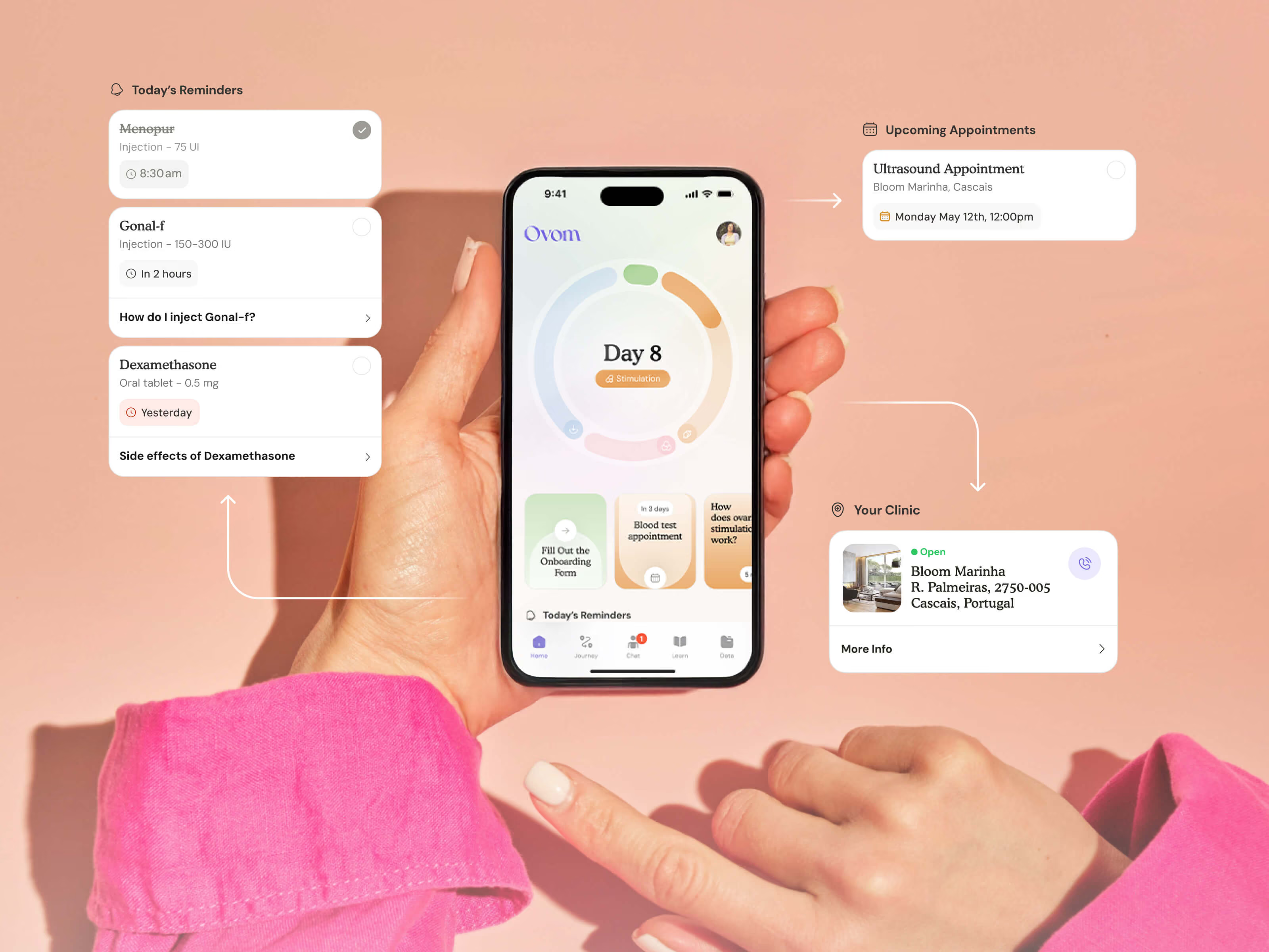
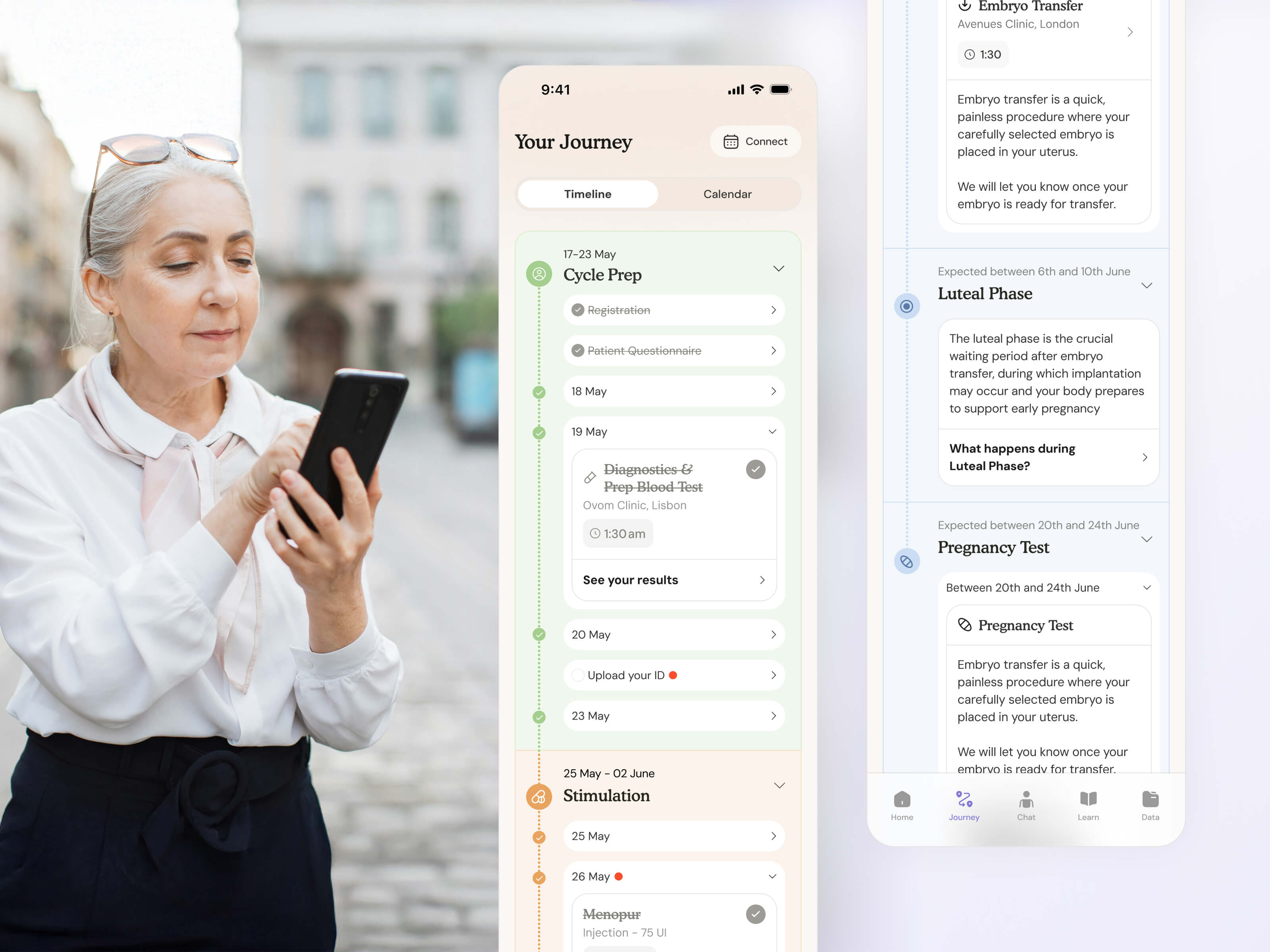
→ The home screen answers a crucial question: where am I? A phase-aware timeline shows where you are in your protocol and what's coming next, so the weeks ahead feel finite rather than endless.
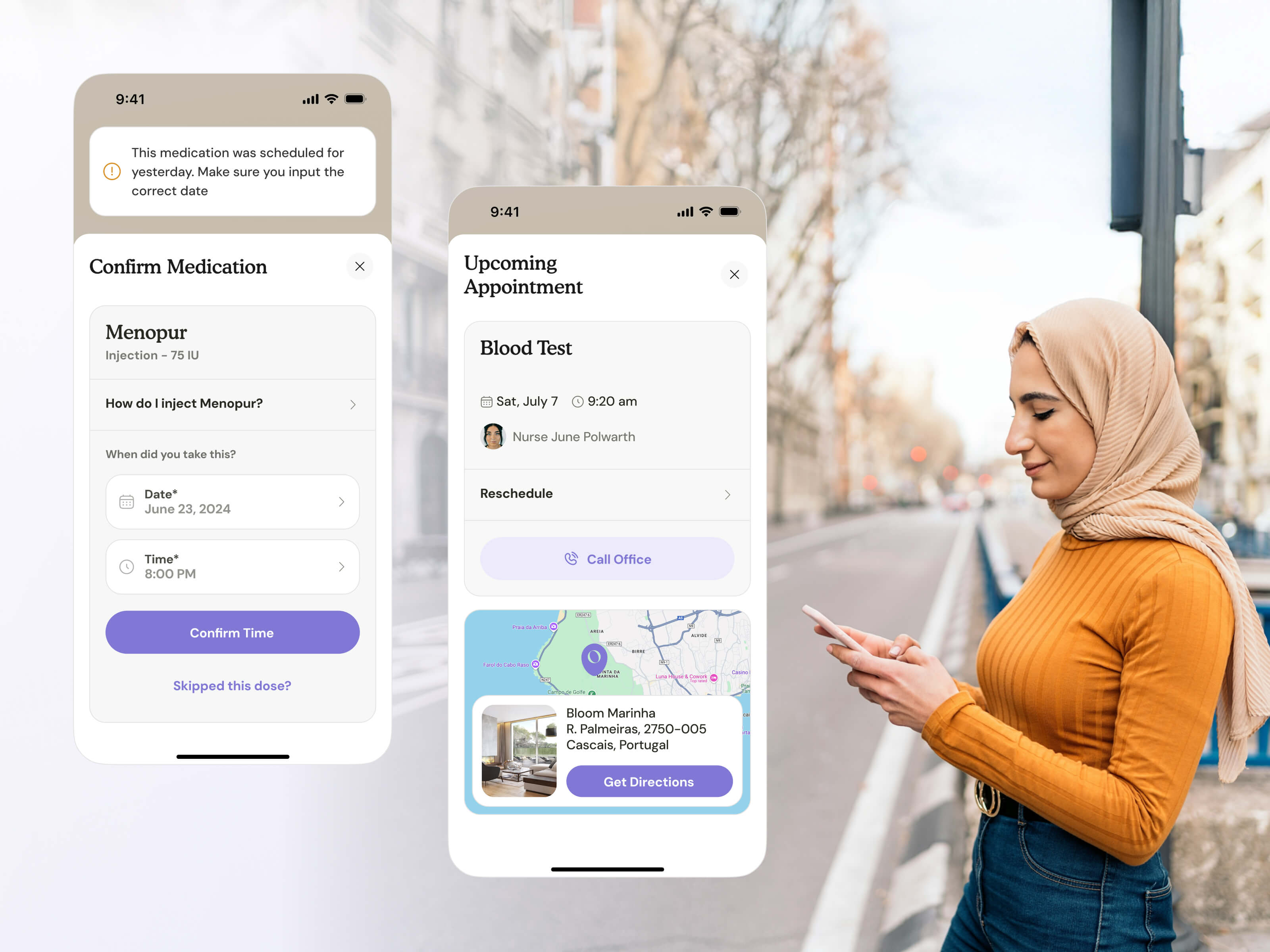
→ Reminders and tasks keep the non-negotiables front and centre: the medication to take, the appointment to make, a quick way to contact your doctor in case of emergency and more.
→ To break free from stale fertility app patterns, we moved symptom logging into a function to help your doctor see how you're responding. Log that you're bloated, exhausted, nauseous, and your clinician sees it on the platform immediately. You don’t need to wait in a phone queue to be heard.
→ The knowledge hub is contextual. The cards you see are tied to your exact stage and your specific medication (the side effects of the drug you're taking, the guidance for the symptom you just logged) written and reviewed by Ovom's own clinicians.
→ Users can chat with their care team in-app, anytime. There’s a real feeling of being walked through the process by the hand with a deeply personal, tech-enabled experience.
2. Turning clinical complexity into clarity for clinicians
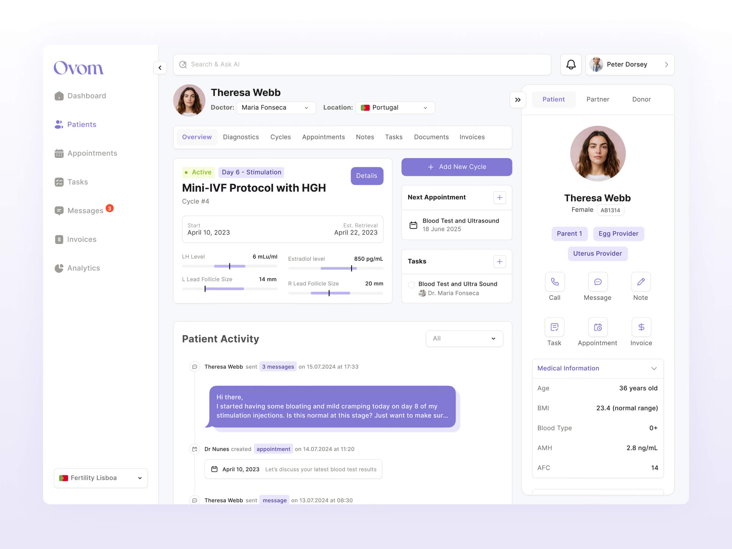
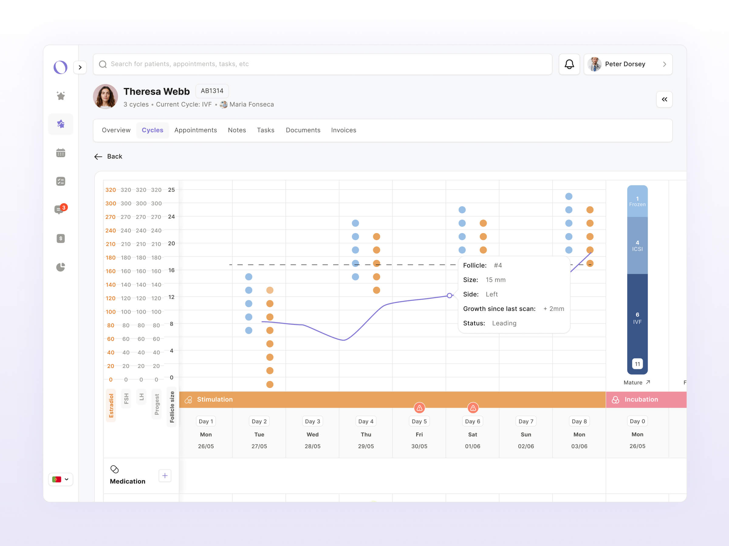
→ The volume of clinical data we were faced with was immense: IVF protocols, blood panels, test types, scans, medications, appointment types, patient types, as well as the edge cases that make fertility care especially tricky.
→ At the start, everything was a priority. Every field and panel was equally urgent. Our work was deciding, with the medical team, what each doctor actually needs to see, and when.
→ Clinical software is infamously clunky. In fact, all the doctors we interviewed were extremely frustrated with the software they use. They were sceptical that Ovom wouldn’t be able to deliver on the promise of better software. To address these concerns, we designed it hand-in-hand with the clinicians. Some screens were pure UX. Others were a deep reorganisation and redesign of pre-existing, dense screens, taking a wall of graphs and data so that a doctor can digest it at a glance.
3. Designing AI that works where the clinician naturally goes
→ Lumi designed AI into the background of the platform. We set it up to surface flags from the clinical picture, like an abnormal blood result or a trend suggesting a medication isn't doing its job, and raise them to the doctor rather than wait to be asked.
→ We designed AI into search, too, so a clinician pulling up a patient gets in-context prompts: a summary of the current cycle, a check for missed medication, a suggested next step. The principle throughout is support that proactively comes to the clinician, not a feature parked in a corner waiting to be found.Knew when to follow established patterns and when to push beyond them.
4. Designing with the people who'd use it
→ Every decision was validated weekly with real patients and real clinicians but the people who would actually use the product.
→ The feedback was in-depth. Clinicians worked with us to deeply scrutinise prototypes week after week.
→ Scope expanded and contracted in response: features grew, shrank or changed shape based on living user feedback and clinicians’ needs rather than a fixed spec.