

Right now, your startup probably looks like this ⬇️
You've built a self-serve product. Refined your onboarding. Tracked every activation metric. Then you launched with a homepage cobbled together in an afternoon, convinced the product will sell itself.
Now imagine converting 6% of website visitors instead of 2%. That's not 3x more qualified signups feeding your entire product-led growth engine. More product-qualified leads. Higher sales velocity. Lower customer acquisition cost. Your growth rate accelerates month over month.
The difference isn't budget, traffic quality, or luck. It's treating your website as the first product touchpoint instead of a marketing afterthought.
In this article, we're sharing exactly what separates good PLG websites from broken ones, as startup veterans who build product-led growth websites on the daily. ⬇️
What is product-led growth website optimisation?
Product-led growth website optimisation focuses on designing and building websites that convert visitors into product users through clear value propositions, intuitive navigation, and friction-free signup flows. Unlike traditional marketing sites, PLG websites treat the homepage as the first product touchpoint, optimising for self-service conversion rates of 3-6% or higher.
The PLG conversion problem
Quick question: what's your website-to-signup conversion rate?
If you answer "around 2-3%," you're in the majority. If you said "I don't know," things are about to get slightly uncomfortable.
The median for product-led SaaS is 3-6%. Anything below 2% means you're hemorrhaging potential customers. The top performers convert at 18%.
That's a 9x difference between good and great.
Now here's where it gets interesting: of those who do sign up, only 9% of free accounts convert to paid customers on average. Companies using Product Qualified Leads (PQLs) see 3x higher conversion rates — up to 30-39% depending on ACV.
So if we do the math:
- 2% visitor-to-signup × 9% signup-to-paid = 0.18% overall conversion
- 6% visitor-to-signup × 9% signup-to-paid = 0.54% overall conversion
Same traffic. Same product. 300% more customers.
And that is why your website matters more than you think. 🙌
Your website is onboarding's silent partner
Onboarding doesn't start when someone clicks "Sign up." It starts with the first impression — your marketing content and website.
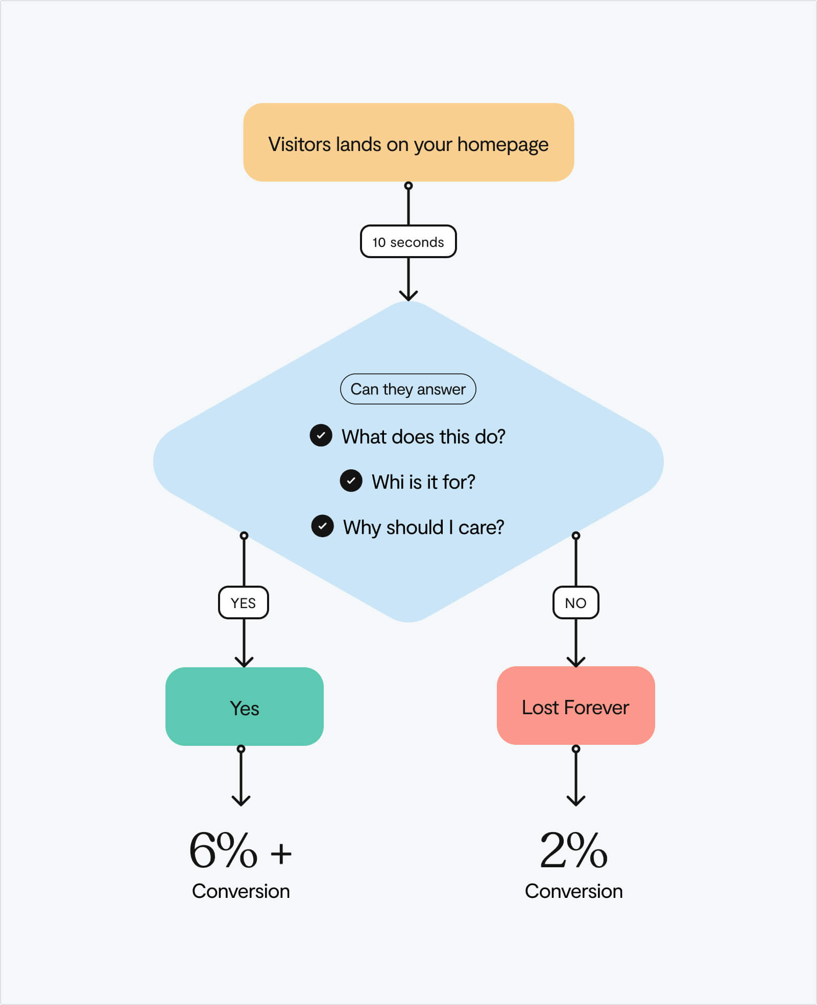
Let’s think about the user journey for a second. Someone discovers your product through search, a referral, or ProductHunt. They land on your homepage. Within 10 seconds, they've formed an opinion about your value.
If your value proposition is unclear, they bounce. If it's clear but your product doesn't match the promise, they churn after signup.
This is why 97% of companies believe good user onboarding is necessary for driving product growth — but most don't realise onboarding starts on the website, not inside the product.
Your website sets expectations. It attracts (or repels) your ideal customer profile. It determines whether high-intent buyers even make it to your signup page.
A great PLG website does four things before someone clicks signup ⬇️
- Clearly explains the problem being solved — This captures attention from the right people and filters out poor-fit leads
- Shows the product in action — In a product-led world, the "how" matters as much as the "what"
- Builds trust immediately — Through social proof, clear positioning, and transparent pricing
- Reduces friction to "try" — Makes signup feel like the obvious next step, not a commitment
Research shows that 80% of users spend their time above the fold, which means you have seconds to nail these four elements. Miss any one of them, and your product-led motion breaks before it begins.
The 4 website mistakes killing your PLG conversion
Most PLG websites fail for identical reasons. Here's what we see every time:
.jpg)
1. Value propositions that could apply to anyone
❌ "Powerful project management for modern teams."
❌ "The all-in-one workspace for your business."
❌ "Streamlined workflows that drive results."
These statements say nothing. They're placeholders masquerading as positioning.
A study by Nielsen Norman Group found that pages with clear value propositions hold attention 1-2 minutes longer — but only if you communicate that value within 10 seconds.
💡 The fix: Use the 5+1 messaging framework. State the market context, define the specific problem, identify who you're for, explain why existing solutions fall short, present your solution, and include social proof.
2. Treating all visitors the same
Not everyone who lands on your site is equally likely to convert. Yet so many PLG websites serve identical experiences to everyone — from your ideal customer to random tire-kickers.
The best PLG companies segment visitors and personalise the experience based on fit. This requires user research methodologies that reveal how different segments interact with your website.
Tools like Segment identify high-value leads via IP lookup and adapt messaging accordingly. This has massive impact: self-serve leads who see personalised content convert at higher rates than those getting generic experiences.
💡 The fix: Start simple. If you can't implement advanced personalisation, at minimum create separate landing pages for different use cases or industries. A marketing automation platform shouldn't show the same homepage to an e-commerce store and a healthcare provider.
3. Hiding or over-complicating the product
Product-led growth means the product sells itself. But if visitors can't see or understand your product before signup, you're essentially asking them to buy blind.
The best-performing PLG websites don't just describe features, they show the actual interface, include demo videos, or offer interactive product tours. Webflow, Figma, and Notion all prominently feature their UIs because in a product-led world, showing is better than telling.
💡 The fix: Add product screenshots, demo videos, or interactive walkthroughs above the fold. If your product is visual, make it the hero of your homepage. If it's complex, use short Loom videos that show real workflows, not marketing fluff.
4. Friction-heavy signup flows
Product-led companies experience 50% annual growth rates — but only if they minimise time-to-value. Every extra field in your signup form, every additional step before someone experiences your product, increases drop-off.
Research on product-led onboarding shows that minimising required fields, offering social login options, and mobile-optimising signup flows dramatically improve conversion. Yet many startups still require company name, phone number, use case, team size, and credit card details before someone can even try the product.
💡 The fix: Ask yourself: what's the absolute minimum information you need to create an account? Email? Great, start there. Everything else can come later, after they've experienced value. Freemium models convert visitors at 12% — a 140% higher rate than free trials with more friction.
4 website elements to optimise for PLG
Not all website improvements deliver equal returns. Here are the elements we’ve found to consistently drive the biggest impact ⬇️
Above-the-fold clarity
Your hero section needs three things:
- A clear value proposition
- A primary CTA
- Immediate trust signals.
That's it. It doesn’t require any clever wordplay, buzzwords, or vague promises.
Clear value proposition placement boosts customer interaction rates by up to 35%. The companies crushing PLG — Slack, Dropbox, Calendly — all nail this. Their homepages answer ✅"What is this?" and ✅"Why should I care?" in under five seconds.
Product demonstration
Your product is your best salesperson. Show it off. Whether through screenshots, videos, or interactive demos, visitors need to see what they're signing up for.
This doesn't mean a generic "platform overview" video. Show specific, valuable workflows. Calendly shows their booking interface in action. Notion displays real workspaces. Figma lets you explore actual design files.
The goal: eliminate the question "But what does it actually do?"
Social proof that builds credibility
Not all social proof is created equal. ❌"Trusted by 10,000+ companies" means nothing to a skeptical visitor. But ✅"Used by Toyota, Skanska, and The New York Times" builds immediate credibility.
The most effective PLG websites use multiple forms of social proof: recognisable customer logos, specific metrics ("Improved activation by 47%"), G2 badges, and short testimonials that address specific objections.
Place these trust signals near conversion points — next to your signup CTA, on your pricing page, and throughout your feature descriptions.
Transparent, accessible pricing
Here's a controversial take: hiding your pricing doesn't protect you from competitors, it just irritates the hell out of potential customers.
PLG companies with transparent pricing convert better because visitors can self-qualify. If your product costs $499/month and someone's budget is $50/month, let them figure that out before wasting your sales team's time (or theirs).
The best PLG pricing pages clearly segment plans, highlight the most popular option, address common questions, and make starting easy. 🙌
How to audit your PLG website (in 15 minutes)
Want to know if your website is helping or hurting your product-led growth? Run this quick diagnostic:
- The 3-second test: Show your homepage to someone unfamiliar with your product. After 3 seconds, ask them: "What does this company do, and who is it for?" If they can't answer, your value proposition needs work.
- The screenshot test: Remove all text from your homepage. Can you still understand what the product does from the visuals alone? If not, you're under-showing your product.
- The friction audit: Count how many fields someone needs to fill out to start using your product. Each additional field cuts conversion by 5-10%. Get ruthless about what's truly necessary.
- The mobile check: Pull up your site on your phone. Can you easily navigate, understand the value, and signup? 62.54% of global website traffic is mobile. If your mobile experience sucks, you're losing more than half your potential customers.
- The social proof scan: Look at your testimonials and logos. Would they convince you to trust this product? If they're generic or from unknown companies, they're not providing enough value.
Run through these five checks, and you'll immediately spot the gaps between your current website and one optimised for product-led growth.
The compounding effect of getting this right
PLG companies with optimised websites don't just convert better — they grow faster with better economics.
Product-led companies grow at 50% annually vs. 21% for traditional SaaS. They achieve this through self-serve funnels that scale without proportional increases in sales headcount. But the foundation of that flywheel is getting strangers to become users.
Fix your website conversion from 2% to 6%, and suddenly:
✅ You're getting 3x more signups from the same traffic
✅ Your Product Qualified Lead pool grows proportionally
✅ Your sales team works higher-intent leads
✅ Your overall customer acquisition cost drops
✅ Your growth rate accelerates
This compounds. Month over month, quarter over quarter.
And it all starts with treating your website as the first step in your product-led growth strategy, not as a marketing asset separate from your product funnel.

Where to start
If you're running a product-led company and your website-to-signup conversion is below 3%, start here:
This week:
- Run the 3-second test and the friction audit. These take 30 minutes total and reveal your biggest gaps.
- Use frameworks like ICE scoring to prioritise which website fixes will have the highest impact.
This month:
- Rewrite your value proposition using the 5+1 framework
- Add product screenshots or a demo video above the fold
- Reduce your signup form to the bare minimum
- Before you ship changes, validate your assumptions with users to make sure your new messaging resonates.
This quarter:
- Implement basic segmentation
- Create use-case-specific landing pages
- Add robust social proof near conversion points
- Consider tools like Hotjar or Microsoft Clarity to see where users actually struggle.
If your website isn't converting traffic into signups, you're leaving growth on the table. The problem is that your front door is broken. And in product-led growth, the journey from stranger to customer starts way before someone hits your signup page.
Ready to turn your website into a growth engine? We've helped 50+ startups design and build sites that convert visitors into customers and attract investors. Let's chat about yours.
Not sure where to start? Our guide to choosing a UX agency helps you evaluate design partners who understand PLG conversion.
Frequently Asked Questions
What is a good conversion rate for a PLG website?
The median website-to-signup conversion rate for product-led SaaS is 3-6%. Top performers hit 18%. Anything below 2% signals problems with your website experience.
How do I calculate my PLG website conversion rate?
Divide monthly signups by monthly unique visitors, then multiply by 100. For example: 200 signups ÷ 10,000 visitors = 2% conversion rate.
What's the difference between a PLG website and a traditional SaaS website?
PLG websites treat the homepage as the first product feature, optimising for self-service signups. Traditional SaaS sites focus on generating sales leads. PLG sites need clearer value props, visible product demos, and lower signup friction.
Should I use a free trial or freemium model for PLG?
Both convert free accounts to paid at similar rates (9% average). However, freemium models convert website visitors 12% higher than free trials – a 140% improvement. Choose based on your product complexity and sales cycle.
How long should my PLG signup flow be?
Minimise required fields to essential information only (typically just email). Every additional field reduces conversion by 5-10%. Add optional fields after users experience product value.


