


You've been told to build quality code, avoid shortcuts, do things the right way. But the MVPs that win are held together with duct tape and determination. Speed is everything when you're trying to find product-market fit.
The issue isn't taking on technical debt. It's knowing when to pay it down.
In this guide, we'll show you exactly which early UX decisions create scaling bottlenecks – and more importantly, how to make those decisions strategically from day one. ⬇️
A paradox of strategic debt
Early-stage founders sit in a real paradox. You need to move fast enough to find product-market fit before you run out of runway. But you also need to build foundations solid enough to scale once you find it.
These feel like opposing forces: ship fast or build right.
The key is knowing which shortcuts accelerate validation and which ones become anchors for your architecture.
Strategic debt vs. toxic debt
There's a key distinction here.
Strategic debt is the conscious trade-off you make to validate your market faster. You choose a simpler state management approach. You skip building a comprehensive component library. You hardcode things that should be configurable. These decisions buy you speed when speed is everything.
Toxic debt is what happens when those shortcuts become permanent. When the "temporary" workaround becomes the foundation of your product. When every "let's ship this fast" decision creates a web of dependencies that makes simple changes take exponentially longer.
The danger zone is the scale-up phase between your MVP and a mature product. You'll know you've hit the wall when:
- Velocity drops: Simple features take twice as long to build as they used to
- Regression bugs multiply: You fix one thing, and something unrelated breaks
- Enterprise deals stall: Customers ask for features your architecture can't support
Ultimately, the development approach that got you from $0 to $20K is probably not the one that can get you to $100K. Not because it was wrong. Because it is optimized for speed, not scale.
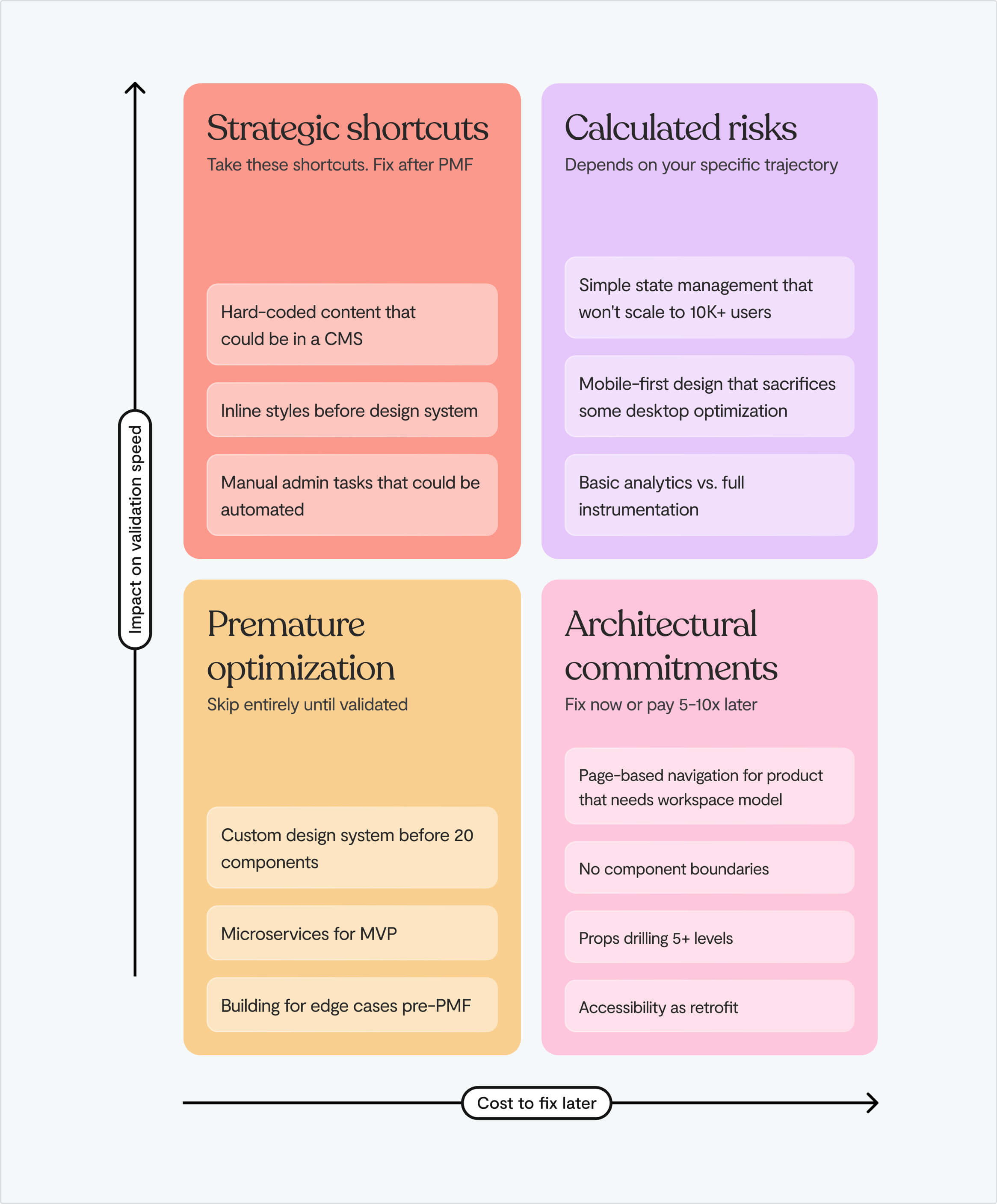
The four UX decisions that determine your scaling ceiling
Founders tend to not realise they're building ceilings into their product. They're often reasonable choices made under pressure that create compounding problems down the line.
Let's break down where early UX decisions become later constraints. ⬇️
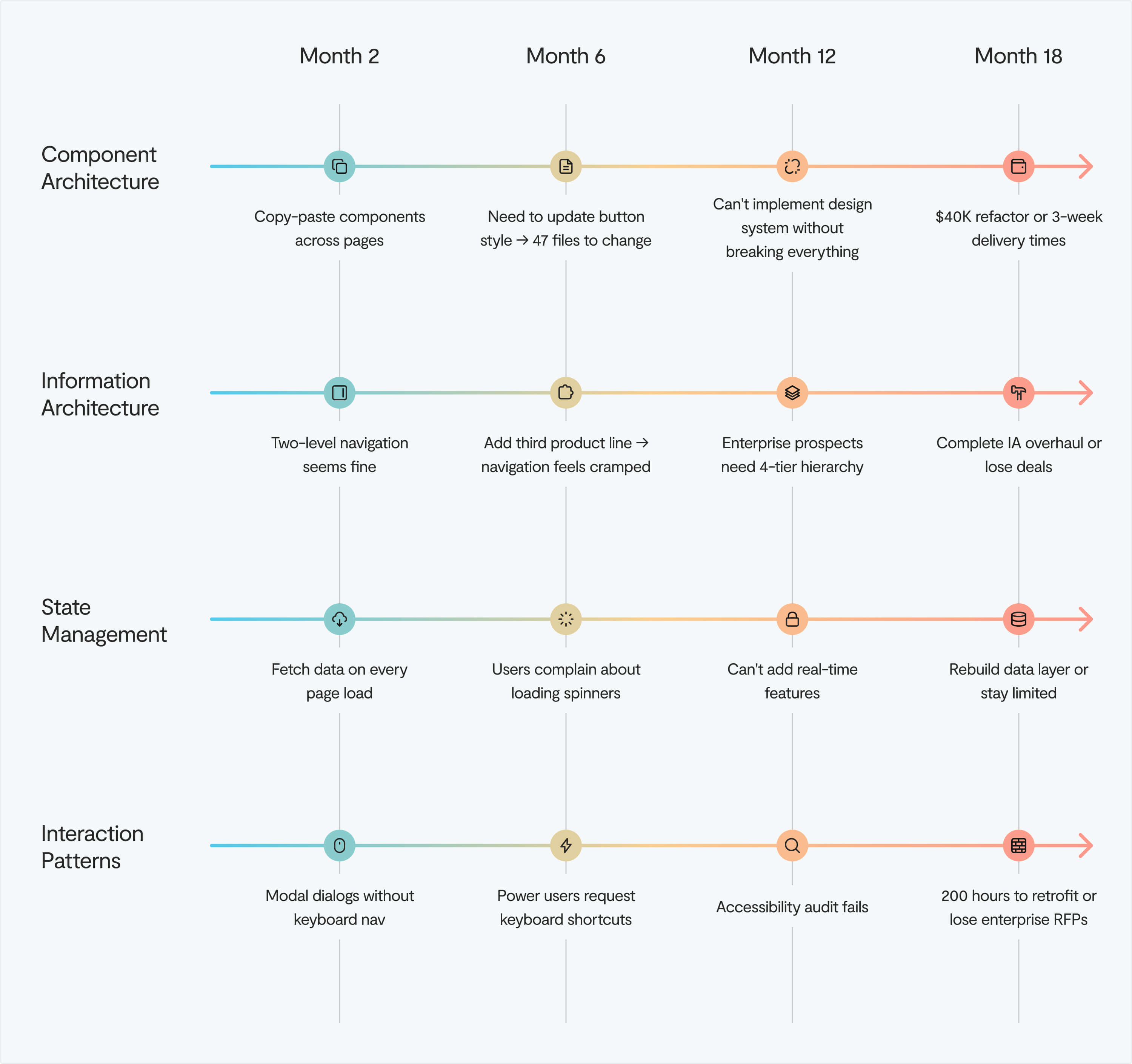
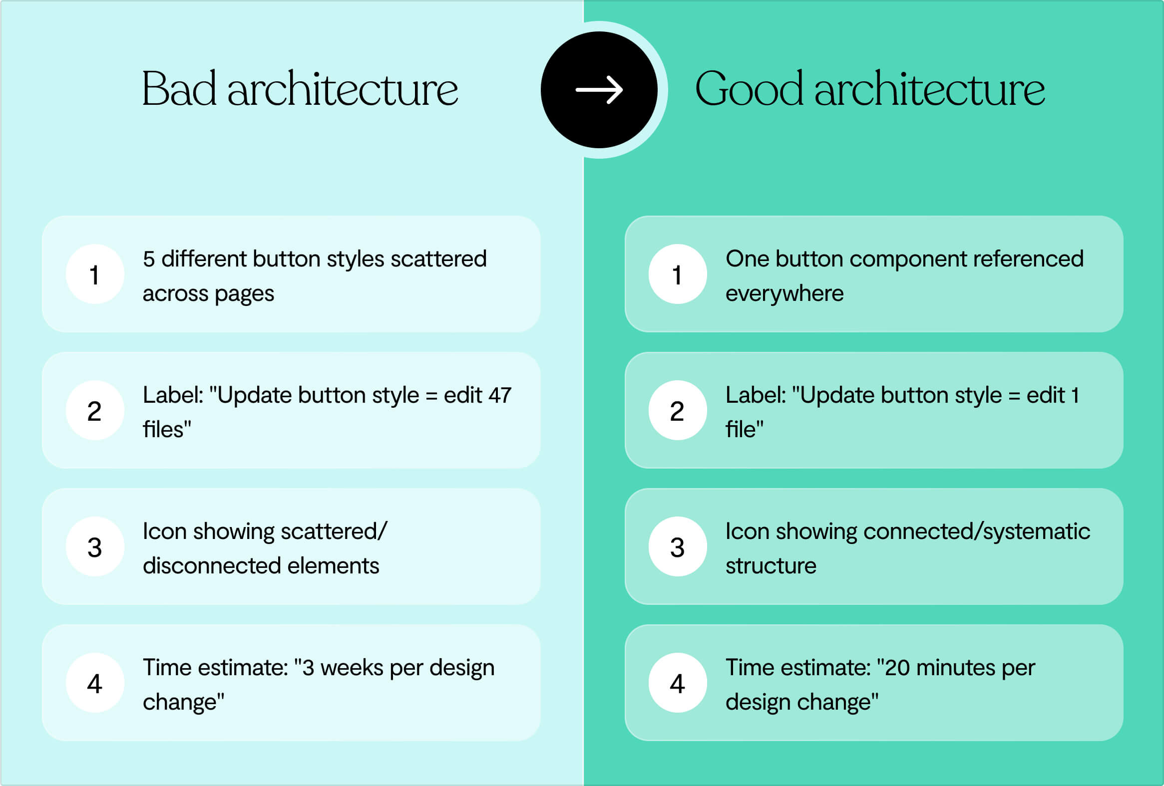
Decision 1: Component architecture
The pattern looks harmless at first: you need a button, so you build one. Then you need a slightly different button, so you build another.
Six months later, you have eight button variants across your codebase, each styled differently, each behaving slightly differently under edge cases.
Research from Delivery Hero showed that every single project release incurred front-end debt, costing significant time and resources. When they ran an experiment comparing development with and without a design system, they found a 57% saving on time-to-market with zero debt.
The consequence is that developers spend 40% of their time on code maintenance, refactoring, and debugging. Time that could go toward building features that move your business forward.
We see this with startups who see design systems as corporate overhead. Then they hit 10 engineers and realize every new feature requires coordinating eight different button styles, three form patterns, and five loading states. What started as moving fast becomes a dead weight dragging you down.
Decision 2: Navigation and information architecture
You choose an inverted-L navigation pattern (horizontal top nav plus left sidebar) because it looks clean and modern. It works great for your MVP.
The problem is that an inverted-L can accommodate sites that are no more than 4 tiers deep. But B2B SaaS products rarely stay that simple.
Six months post-launch, you've added new feature sets, admin panels, reporting dashboards, and team management. Your content hierarchy is now 6-8 tiers deep. You're faced with two options: rebuild the navigation structure from scratch, or cram all the content into 4 tiers inappropriately, creating a confusing user experience.
The principle of growth is simple but often ignored: assume that the content on your website will grow, and make sure the website is scalable.
Navigation is the skeleton of your product. Choose wrong early, and every feature you add makes the problem exponentially worse.
Decision 3: State management and data patterns
The fastest way to get data on screen is fetch-on-render: components load, then request their data, then display it. It's intuitive. It's what most tutorials teach. And it's a scalability nightmare.
Fetch-on-render creates request waterfalls where each component waits for the previous one to finish before starting its own request. Users see loading spinners cascade down the page. Performance tanks. And when you try to add real-time collaboration features or optimistic updates, you discover your entire data architecture needs to be rebuilt.
The alternative – render-as-you-fetch – is more complex upfront. It requires thinking about data dependencies, implementing caching strategies, and coordinating updates across components. But it's better at scale because it decouples data fetching from rendering logic, allowing your UI to respond immediately while data loads in the background.
➡️ How you handle the states early determines whether adding collaborative features later takes 2 weeks or 6 months.
Decision 4: Interaction patterns and accessibility
Modal dialogs seem simple: overlay content, blur the background, add a close button. But accessible modals require proper ARIA roles, focus management, and keyboard navigation. Skip these in your MVP, and you've created technical debt that compounds with every modal you add.
When accessibility is retrofitted rather than built in, teams discover interactive elements that quietly break, modals that open but never announce themselves to screen readers, and buttons that look perfect but say nothing to assistive technology.
The interaction patterns you establish early – how modals work, how forms validate, how errors display – either support accessible implementations or fight against them.
Product-market fit is a dev mirage
Early traction can mask fundamental problems.
You've got users. Revenue is growing. Customer feedback is positive. You assume you've nailed product-market fit. But early adopter enthusiasm doesn't equal mainstream viability. ⬇️
Early adopters are a unique breed. They're willing to tolerate friction, incomplete features, and high prices because they're sufficiently desperate for a solution. Their enthusiasm feels like validation, but it's often a mirage.
Research from First Round Capital shows that 70% of startups with strong early adopter love fail to scale because their product serves edge cases, not mainstream needs.
When good traction masks bad foundations
Success breeds dangerous assumptions. It’s tempting to stop conducting user research after your MVP gains traction. To assume you know what users want and build features based on internal opinions rather than external data.
➡️ This disconnect leads to feature bloat and misaligned priorities. Users struggle with interfaces designed for imaginary problems while their real pain points remain unsolved.
This is particularly true with B2B. In enterprise software, the dynamic of buyer versus end user sets the scene for churn. The person who signs the contract isn't the person using the product daily.
If you've optimized your UX for impressing buyers rather than serving end users, you'll see frightfully low adoption. When renewal time comes, the software is seen as not useful, regardless of how sophisticated your sales pitch was. ⚠️
✅ Look for these signals of real product-market fit:
- Customer support tickets shift from "How do I?" to "Can you also?"
- Prospects reach out to you rather than vice versa
- Annual customer retention exceeds 80%
⚠️ Instead of:
- High acquisition but low engagement, where customers sign up but rarely use the product
- Positive feedback but low referral rates
- Revenue from customers who match your early adopter profile exclusively
- Customers use your product occasionally rather than making it integral to daily operations
Most customer retention issues originate in sales and marketing, not in product. Retention is driven by the types of customers targeted by marketing and the expectations set during the sales process. If your UX can't deliver on the promises your sales team makes, you don't have a product problem, you have an alignment problem.
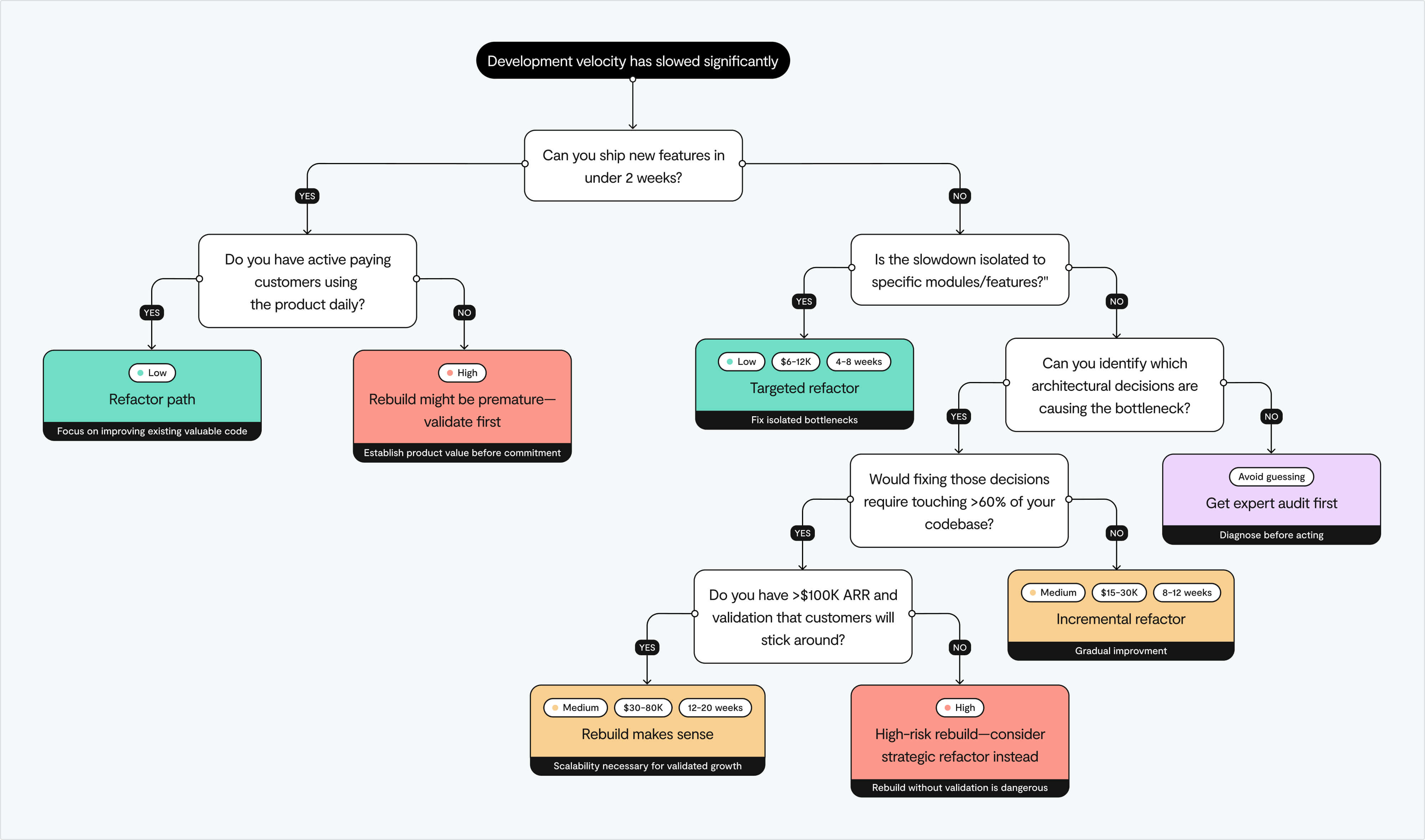
How to decide to refactor vs. rebuild
Most startups eventually face this question: do we fix what we have or burn it down and start over? The answer isn't obvious, and getting it wrong is expensive.
Refactor
Refactoring means improving your software's internal structure without changing external behavior. You're paying down technical debt gradually, making the codebase more maintainable while continuing to ship features.
When done right, it's surgical: you identify the 30% of your code causing 80% of your problems and fix it systematically.
When refactoring makes sense
Here's what usually happens: a founder is convinced they need to burn it all down and start over. Then someone actually audits the code and finds that 70% of it is fine. It's that other 30%, the poorly architected parts, causing all the chaos.
Fix those specific bottlenecks, and suddenly everything works. And it takes weeks, not months, without the nightmare of migrating customers to an entirely new system.
The limitation is that refactoring operates within the constraints of your existing architecture. If the foundation is fundamentally broken – if your architecture can't support the features your market demands – refactoring is just treating symptoms rather than curing the disease.
Rebuild
Rebuilding means dismantling old architecture and writing new code aligned to modern best practices, with no constraints from past design decisions. It's the nuclear option: expensive, risky, but sometimes the only way forward.
When rebuilding becomes necessary
Look at Basecamp. They've rebuilt from scratch multiple times, each version a complete rewrite reflecting new technologies and product vision. Why? Outdated code, mounting technical debt, and scaling problems that couldn't be fixed with refactoring alone.
Their solution to this cycle? Build less, but build it better. Fewer features, higher quality. Turns out that minimalist approach means less maintenance and fewer situations where you need to burn it all down and start over.
Building a new product can occur in parallel with ongoing development, which is a much cleaner and more productive approach. But be prepared: migrations are substantial projects on their own and require serious commitment.
Doing a bit of both
In real life, most teams don't fully refactor or rebuild. They land somewhere in the middle. You might rebuild your state management layer while refactoring your component architecture. You might extract critical features into new microservices while maintaining the monolith for less critical paths.
The key is honesty about your goals and limits. Refactoring is boring but safer. Rebuilding is exciting but risky. Your users don't care how beautiful the code is—they just want the app to work.
At Lumi, we help startups identify which 30% of their frontend is creating 80% of their scaling problems. Then we build a surgical plan that balances the need to keep shipping with the imperative to build sustainable foundations.
How to build scalability into your UX decisions
The best time to address scaling problems is before they exist. Here's how to build for the startup you'll become, not just the startup you are.
Prototype
Validate fast without creating toxic debt
During MVP development, speed matters more than scale. You should be making conscious trade-offs. The key word being "conscious."
- Use managed services for everything you can. Don't set up your own servers, databases, or infrastructure. Heroku, Vercel, Railway abstract away DevOps complexity. Yes, it costs more than running your own infrastructure, but your time is worth infinitely more than the cost difference.
- Keep your dependencies minimal. Every library you add is a potential maintenance headache down the line.
- Budget 25-30% of dev time for QA, bug fixing, and iteration even in the MVP stage. Users may forgive missing features, but not broken ones.
- Document what you're deferring. Create a quick "technical debt log" that explains why you made each shortcut and what the proper solution would look like.
Every extra feature you add before validation multiplies technical debt. Speed matters more than scale. You can iterate in public once users care.
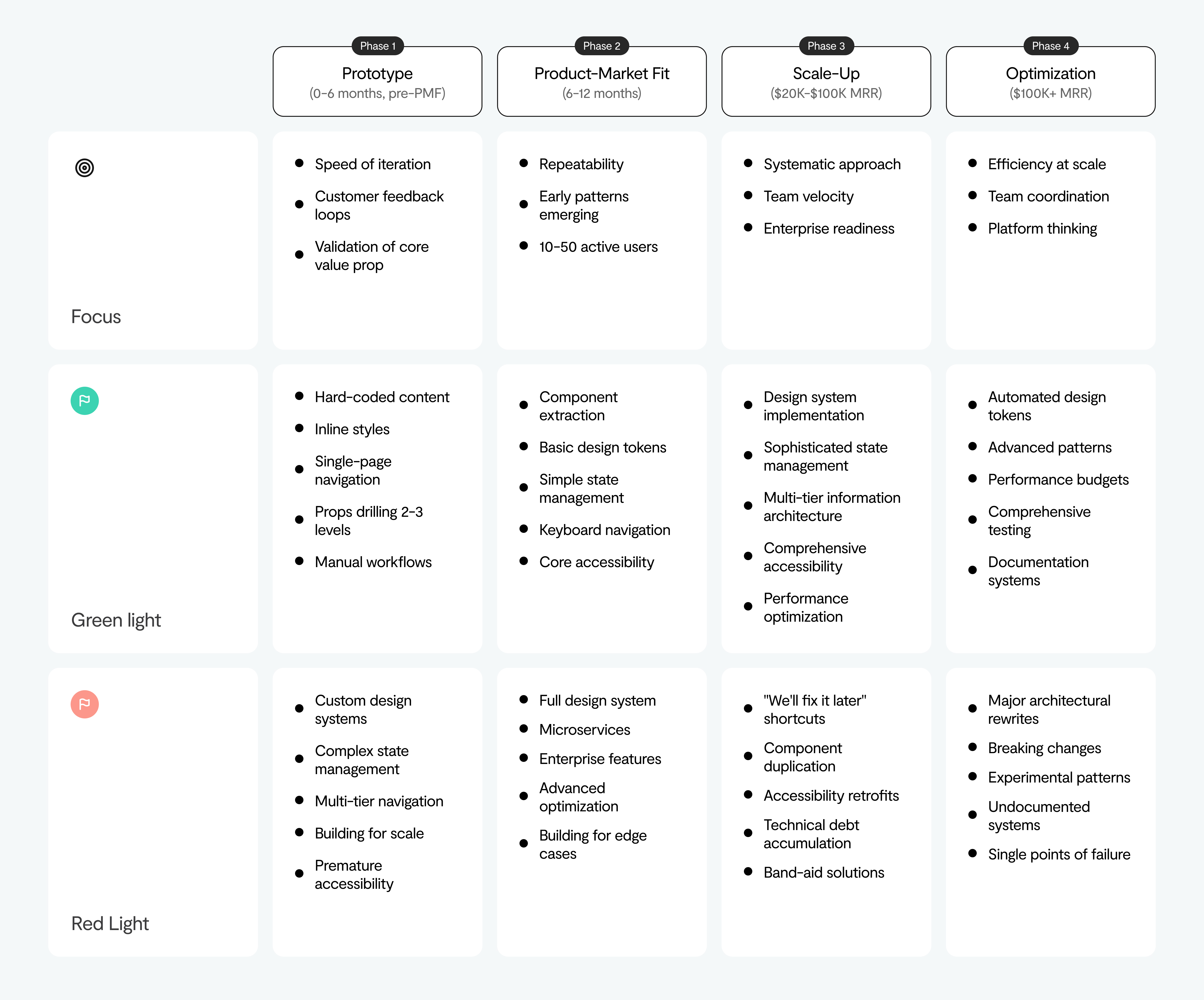
Product-market fit
Systematic understanding of what's working
This is the dangerous phase. You have traction. Revenue is growing. The temptation is to keep your foot on the gas and just ship, ship, ship. But success breeds assumptions.
What to do instead:
- Establish continuous research cycles: interview users monthly, track behavior data weekly
- Start tracking design decisions and rationale (this becomes invaluable when new designers join)
- Begin component standardization before you have 47 different button implementations
- Set up basic design system foundations. Not a full system yet, but just the structure for one
If simple features take twice as long to build as they did six months ago, you've crossed from strategic to toxic debt.
Scale-up
Building systems alongside growth
This is where you can invest in operating models, management rhythm, and role clarity early, not as an afterthought.
- Audit your technical platform state – what's working, what's not, where are the bottlenecks?
- Create temporary "tiger teams" to fix the biggest debt
- Invest in design systems properly. Not just a Figma library, but a living system with documentation, usage guidelines, and automated testing
- Build systems alongside growth, not after growth has already created chaos
This is when you can audit the state of your technical platform, sponsor initiatives in product teams, and create temporary tiger teams to address the most critical debt.
Optimisation
Mature operations
By this point, you're no longer a scrappy startup. You need:
- Mature design operations with clear ownership and processes
- Full design system with component libraries that development can actually use
- Continuous refactoring as part of normal development flow
- The discipline to rebuild or buy capabilities when it makes strategic sense
Treat technical debt like a credit card. Use it to move fast when it matters, and pay it down responsibly before the interest rates crush you.
Final thoughts
The companies that break through the $20K wall didn't wait until they had no choice. They fixed it when the cost was $40K, not $200K.
If enterprise deals are stalling on features you can't deliver, if simple changes take weeks instead of days, you're already there.
Book a free strategy session with Lumi. We'll show you what's killing your velocity and what to do about it now in a zero pressure chat.


