

Stop redesigning your website.
Seriously. That's our advice.
The startups winning at conversion aren't the ones with the prettiest homepages. They're the ones running experiments every week, learning from failures, and compounding small wins.
We've run hundreds of website tests over the years. A lot failed, because they often do (and if you read on, you’ll find out why that’s completely okay).
But the ones that worked doubled signup rates, cut bounce rates in half, and turned mediocre websites into conversion machines.
This is everything we learned about testing when you're moving fast and can't afford to guess. ⬇️
Are you ready to test? (A checklist)
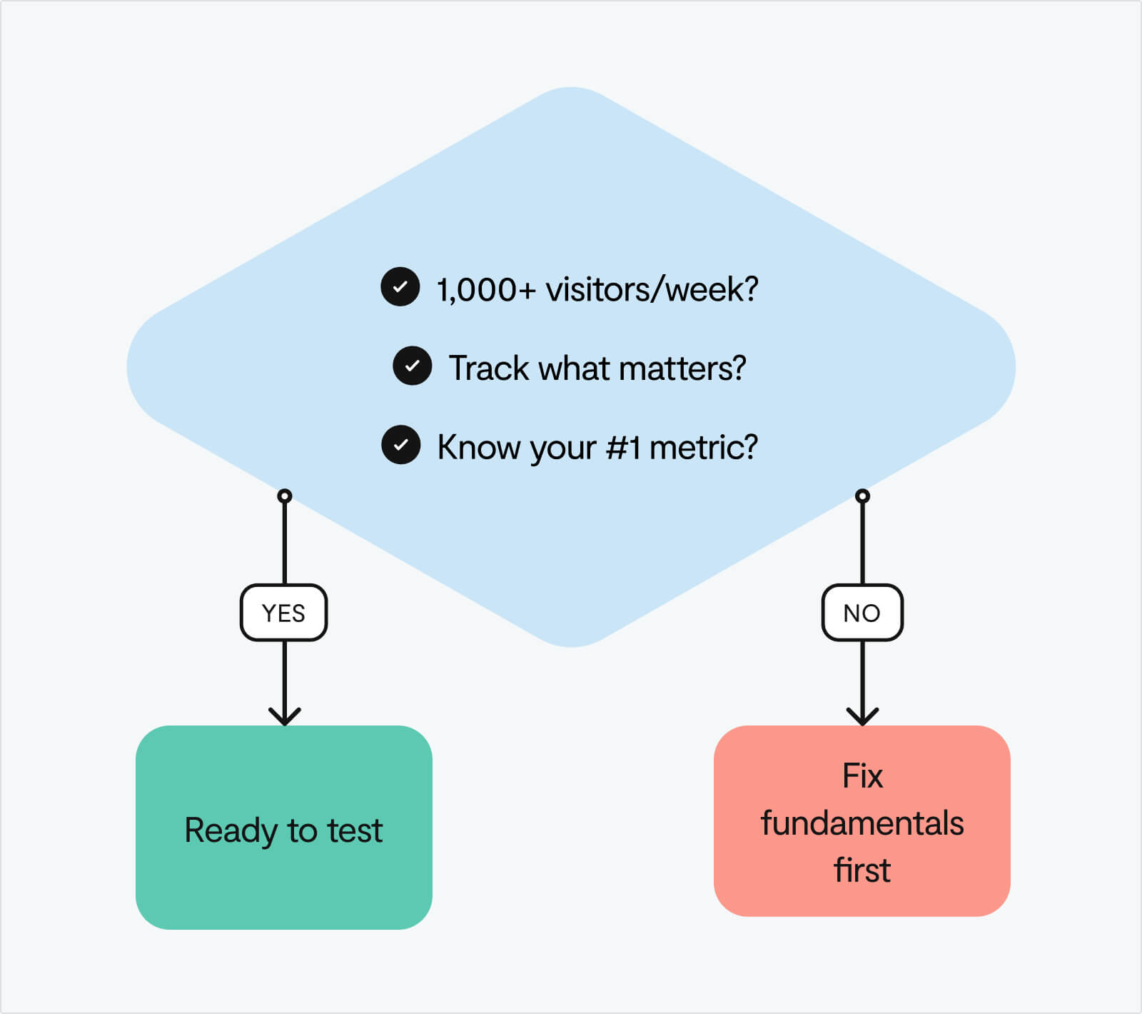
Before you A/B test anything, answer these three questions:
1. Do you have 1,000+ visitors per week?
Below that, your tests won't reach statistical significance. You'll be making decisions on noise, not signal.
2. Can you track what matters?
If you can't measure signups, clicks, and drop-offs accurately, you're flying blind. Set up event tracking in GA4 or Mixpanel first.
3. Do you know your most important metric?
Current conversion rate. Average time on page. Bounce rate by source. It all starts with finding the right thing to measure.
If you answered "no" to any of these, pause here. Before testing, focus on the fundamentals: clarify your value proposition, speed up your site, and remove obvious friction. These don't need A/B tests, they need straightforward fixes.
Three questions to gauge your readiness:
- What's your current website-to-signup conversion rate?
- Which traffic sources convert best (and worst)?
- What's your #1 conversion bottleneck right now?
Can't answer these yet? That's fine. Start by getting these metrics in place and addressing clear problems. Once you have this foundation, testing will be far more effective.
Why most of your tests will fail (and why that's perfectly fine)
At Google and Bing, only 10-20% of experiments generate positive results. At Microsoft as a whole, one-third prove effective, one-third have neutral results, and one-third have negative results.
Yep, the companies with the most sophisticated testing programmes in the world – Google, Microsoft, Bing – see failure rates of 67-90%.
If you're running tests and most of them aren't winning, you're not doing it wrong. You're doing it exactly right.
The mindset shift that changes everything
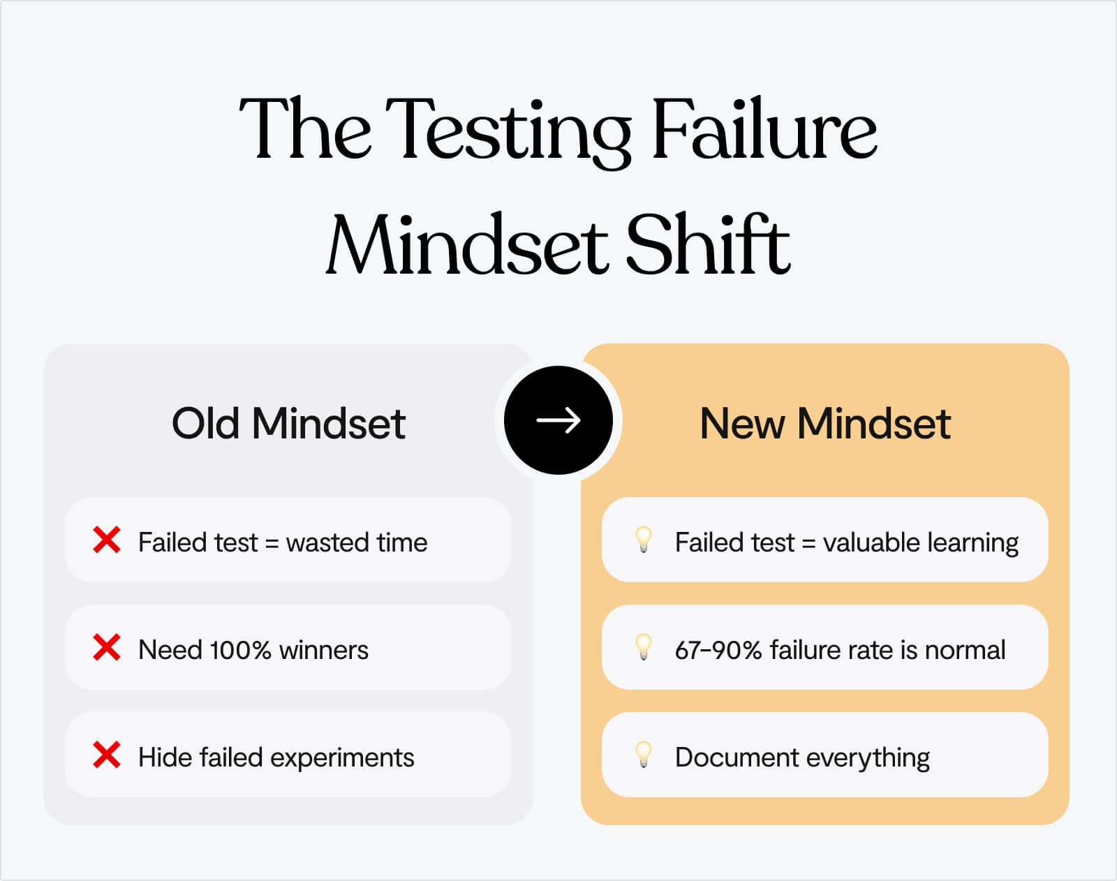
If you ask us, the worst thing you can do when it comes to optimising conversion is sweep your 'failures' under the rug, which just means that you’ll never learn from them.
There are no failed tests, only tests that teach you something different than you expected.
When a test "fails," you've learned one of three valuable things:
1. Your hypothesis was wrong
The change you thought would improve conversion actually didn't matter. That's not failure, that's data. Now you know not to invest engineering resources in building that feature permanently.
2. Your understanding of users needs updating
Users behaved differently than you predicted. This reveals a gap in your user research or assumptions. Fill that gap, and your next hypothesis will be stronger.
3. The problem is elsewhere
Maybe the issue isn't your CTA copy, it's that nobody understands your value proposition in the first place. Creating a safe space for failure, while putting yourself in a position to learn from it, is critical.
Success in testing isn't "winning every test." Success is:
- Learning something valuable from every test
- Building a library of insights that inform future decisions
- Systematically eliminating bad ideas so you can focus resources on what works
- Making decisions based on evidence, not opinions
In experimentation, we either have winners or gain insights. There are no losers in failed tests, only learning opportunities.
If 80% of your tests "fail" but you learn something valuable from each one, you're doing exponentially better than the team that never tests and just guesses at what might work.
Run more tests. Expect most to fail. Learn from all of them. That's how you win. 🙌
The 5 tests every startup should run
Once you've got the basics sorted, start here. These five experiments consistently deliver the biggest impact for early-stage startups.
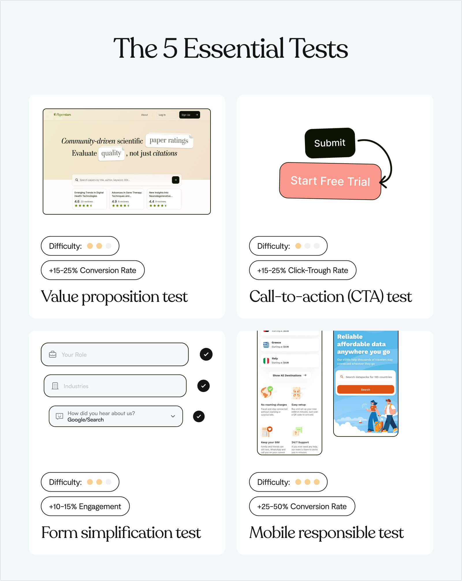
Test 1: Value proposition clarity
Hypothesis: Visitors don't understand what we do in 10 seconds.
What to test:
- Control: Current homepage headline
- Variant: "[Specific outcome] for [specific audience] without [specific pain]"
Why it works:
A case study by Scandiweb showed that improving value proposition clarity increased CTA clicks by 35% Scandiweb. Generic positioning like ❌"Powerful platform for teams" fails because it could apply to anyone. Specific outcomes like ✅"Turn support tickets into insights in 3 clicks for SaaS teams" work because they:
- Define the outcome: "Turn support tickets into insights" (what you get)
- Specify the audience: "for SaaS teams" (who it's for)
- Address the pain: "in 3 clicks" (how it solves the problem faster)
How to write your variant:
- Identify your specific audience (not "teams" or "businesses" – be precise)
- Define the measurable outcome (not "increase productivity" – what specifically improves?)
- Name the pain point you eliminate (not "solve problems" – which specific problem?)
- Add a friction reducer if possible (time saved, ease of use, no setup required)
Example transformations:
- ❌ "Modern workspace for teams" → ✅ "Turn Slack chaos into searchable project docs for remote teams"
- ❌ "Powerful analytics platform" → ✅ "Find your revenue leak in 5 minutes – no SQL required"
- ❌ "All-in-one CRM solution" → ✅ "Close 30% more deals without leaving your inbox"
Test 2: CTA copy
Hypothesis: Generic CTAs don't create urgency or clarity.
What to test:
- Control: "Get Started" or "Sign Up"
- Variant: Outcome-focused ("Start analysing tickets" or "See your dashboard")
Why it works: Changing CTA copy from "Start your free 30-day trial" to "Start my free 30-day trial" increased signups by 90%. Another study showed shifting from "Book a Demo" to "Get Started" more than doubled conversion rates.
People don't want to "get started" – they want to accomplish something specific. The psychology:
- "Get Started" emphasises the beginning of work (negative framing)
- "See Your Dashboard" emphasises the reward you receive (positive framing)
Instead of action verbs, use outcome verbs:
- ❌ "Sign Up" → ✅ "Get My Free Analysis"
- ❌ "Submit" → ✅ "Send Me the Guide"
- ❌ "Download" → ✅ "Get the Template"
Add specificity about what happens next:
- ❌ "Start Trial" → ✅ "Start Tracking Conversions" (tells them what the trial does)
- ❌ "Learn More" → ✅ "See How It Works" (specific about what they'll learn)
Use first-person when possible:
- ❌ "Get Your Report" → ✅ "Get My Report"
- ❌ "Start Your Trial" → ✅ "Start My Trial"
The principle: convey value (what they receive) rather than action (what they must do).
Test 3: Social proof placement
Hypothesis: Trust signals near the CTA increase conversion.
What to test:
- Control: Logos at bottom of page
- Variant: "Trusted by [recognisable companies]" directly under hero CTA
Why it works: Reduces perceived risk at the exact moment of decision. When someone is about to click your CTA, they're making a micro-commitment. Social proof at that precise moment addresses the doubt: "Is this legitimate? Do real companies use this?"
This only works if your social proof is credible.
✅ Use social proof when:
- You have recognisable brand names (Fortune 500, well-known startups)
- You have impressive numbers with context ("Join 10,000+ SaaS companies")
- You have specific, credible metrics ("Helped clients close $50M in deals")
❌ Don't use social proof if:
- Your logos are unknown companies (it actually reduces trust)
- Your numbers are unimpressive ("Join 47 users!")
- Your claims are vague ("Trusted by thousands")
Formats that work:
- Logo bar with 3-5 recognisable brands
- "Trusted by [Company A], [Company B], and [Company C]" as text
- Single impressive client with context: "The same system Microsoft uses to..."
Test 4: Signup form length
Hypothesis: Every extra field kills conversion.
What to test:
- Control: Current form (probably 5-8 fields)
- Variant: Email only (or email + password)
Why it works: This is consistently the highest-impact test because forms are the highest-friction point in your funnel. Research shows that minimising required fields dramatically improves conversion.
Every field you add increases cognitive load and perceived commitment:
🟢 1-2 fields: Feels like low commitment, quick action
🟠 3-5 fields: Feels like moderate effort, needs justification
🔴 6+ fields: Feels like a job application, triggers abandonment
What to ask for upfront:
- Email: Always required (you need it for account creation)
- Password: Optional on signup if you use magic links or social login
- Name: Only if you need it for personalisation immediately
What to ask for later:
- Company name
- Company size
- Phone number
- Role/department
- Use case
- Anything sales wants (but doesn't need for signup)
Test 5: Product visibility
Hypothesis: Showing the UI above the fold increases trust and clarity.
What to test:
- Control: Generic imagery or illustration
- Variant: Actual product screenshot or short demo video
Why it works: Product-led buyers want to see what they're signing up for before they commit. HubSpot generated 24% more form submits by using an image on their landing page. Abstract illustrations or stock photos don't build product confidence, they just fill space.
What to show:
- For SaaS products:
- Dashboard view: Show your main interface with real (anonymised) data
- Key feature: Screenshot of your most compelling feature in action
- Before/after: Visual showing the problem vs. your solution
- For complex products:
- 15-30 second demo video: Show the core workflow, not a marketing video
- Interactive demo: Let visitors click through (tools like Navattic, Arcade)
- Annotated screenshots: Highlight key features with callouts
What NOT to show:
- Stock photos of people using computers
- Generic abstract illustrations
- Empty state screenshots (no data)
- Login screens (show what's inside the product)
How to prioritise these five tests:
Use the ICE framework – score each test on Impact, Confidence, and Ease (1-10 scale).
Impact: How much will this move the needle?
- Consider your current baseline (bigger room for improvement = higher impact)
- Think about traffic volume to this element
- Estimate potential lift based on case studies
Confidence: How sure are we this will work?
- Based on user research, session recordings, or feedback
- Supported by case studies in similar industries
- Addresses a known problem vs. speculative improvement
Ease: How quickly can we ship this?
- Time to design and build
- Technical complexity
- Dependencies on other teams
Multiply the scores – highest number wins.
For most startups, the recommended order is:
- Signup form - Highest impact, easiest to implement
- Value prop - High impact, medium effort
- CTA copy - Quick win, low effort
- Product visibility - High impact if you have strong UI
- Social proof - Only if you have recognisable brands
Not all visitors are equal (and your tests shouldn't treat them that way)
The thing about A/B testing is that aggregate results lie.
👀 A homepage test shows +8% conversion. Looks like a win. Ship it.
But check the segmented data:
- Organic search: +42% conversion
- Paid ads: -12% conversion
- Direct traffic: +3% conversion
The problem with averages: Your test "won" because organic traffic loved the change. But organic was already converting well. Meanwhile, paid traffic – the channel you're scaling – hates the new version.
⚠️ Optimise for the average, and you optimise for nobody.
Always segment your results by ⬇️
Traffic source – Organic visitors are problem-aware (show solutions fast). Paid visitors are skeptical (build trust first). Direct visitors already know you (remove friction).
Device type – Mobile users scan, desktop users read. Long copy can win +30% on desktop while losing -5% on mobile. Test mobile and desktop separately if traffic splits 50/50.
Geography/Industry – B2B messaging varies wildly by region. Enterprise buyers want case studies; SMBs want quick wins. Jargon that builds credibility in one industry creates confusion in another.
When to run separate tests:
If one segment represents >30% of your traffic and behaves differently, test it separately. Don't optimise for averages, optimise for your best customers.
The conversion testing toolkit (by stage)
Your tool stack should match your stage. Here's what to use when. ⬇️
Stage 1: "We just launched, need to find obvious problems"
Traffic: <1,000 visitors/week
Stack:
- Microsoft Clarity (Free) – Watch every session until patterns emerge
- Loom (Free) – Record site walkthrough, share with 10 people, collect feedback
Goal: Find and fix the obvious stuff everyone agrees is broken
Stage 2: "We have traffic, ready to test systematically"
Traffic: 1,000-10,000 visitors/week
Stack:
- Microsoft Clarity (Free) - Keep watching sessions to generate test ideas
- GA4 (Free) - Track conversions, segment by source
Goal: Test high-impact changes, build a testing discipline
Stage 3: "We're scaling, need advanced segmentation"
Traffic: 10,000+ visitors/week
Stack:
- Everything from Stage 2
- Typeform/Tally Pro (Paid) - Advanced survey logic and integrations
- Consider upgrading to Hotjar paid tier or VWO
Goal: Test multiple segments simultaneously, compound wins
No matter your stage, follow this process:
- Set up tools → Watch sessions → Spot patterns
- Prioritise problems → Form hypotheses → Pick one test
- Build variant → Launch test → Monitor daily
- Analyse results → Segment data → Ship winner or iterate
What can free tools give you?
Free tools can give you:
- Session recordings (where people struggle)
- Heatmaps (what people ignore)
- A/B testing (what actually works)
- Analytics (who converts best)
That's everything you need. Upgrade only when free tools become limiting.
How to read session recordings
Session recordings are gold. But watching them randomly is a waste of time.
Here's how to watch efficiently ⬇️
Speed settings
2x speed for general browsing. 1x speed when they hit friction. Skip sessions under 10 seconds (accidental clicks).
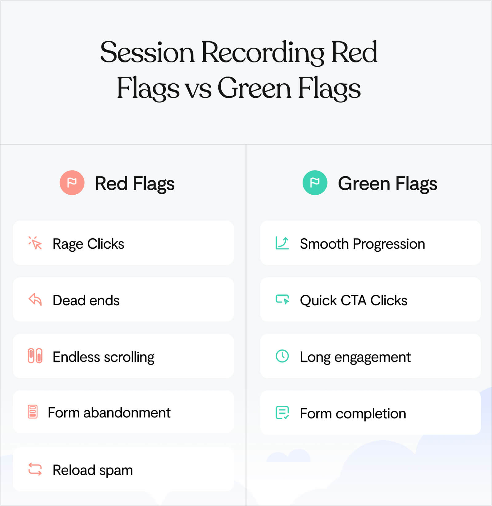
Patterns to spot
Red flags (bad):
🚩Rage clicks: Clicking the same element 5+ times (it's broken or confusing)
🚩Dead ends: Getting to a page and immediately backing out
🚩Endless scrolling: Up and down, up and down (they're lost)
🚩Form abandonment: Start typing, stop, close tab
🚩Reload spam: Refreshing the same page repeatedly (broken expectation)
Green flags (good):
✅ Smooth progression: Homepage → Features → Pricing → Signup (clear path)
✅ CTA clicks within 30 seconds: They understood the value fast
✅ Long engagement: 2+ minutes on site, multiple page views
✅ Form completion: Started form, finished form, submitted
Common patterns and what they mean:
Pattern
Translation
Fix
Users land on homepage, scroll to bottom immediately, leave
Your above-the-fold isn't clear enough. They're hunting for information.
Strengthen your hero section, add product screenshot higher up.
Users hover over CTA but don't click
They're interested but uncertain. Trust/clarity issue.
Add social proof near CTA, make copy more specific about what happens next.
Mobile users pinch/zoom on text
Your font is too small. Accessibility issue.
Increase base font size to 16px minimum.
Users click elements that aren't clickable
Your design signals are misleading.
Make clickable things obviously clickable, remove hover effects from non-interactive elements.
When to redesign vs. when to test
Here's a typical scenario we’ve seen unfold many times:
Website converts at 2%. Team invests 3 months and $30K in a redesign. New site launches. Conversion: 2.3%.
The new site looks better, but the ROI is disappointing.
Why redesigns often underdeliver
❌ Missing the real problem
Teams assume the issue is visual when it's often about clarity. A beautiful redesign can make an unclear message look more professional, without making it clearer.
❌ Changing too much at once
When you ship 47 changes simultaneously, you can't identify which ones helped. Next time you want to improve, you're guessing again.
❌ Designing by preference instead of data
"This looks better" is subjective. "This converted 30% better" is measurable.
Why systematic testing works differently
✅ You learn from every experiment
Test 10 variations and you'll understand your users 10x better, regardless of whether each test wins or loses.
✅ Improvements stack
Small wins compound. +15% here, +12% there, +20% on the third test. Total: +55% improvement.
✅ You control the risk
Test a hypothesis on 10% of traffic for 2 weeks. If it fails, you've risked 10% of conversions for a short period. Compare that to launching a redesign that underperforms – you're risking 100% until you fix it.
You don't have to choose between redesigning and testing forever. Many startups test for 6-12 months, learn what actually matters, then do a strategic redesign that locks in those learnings.
Test first. Redesign later, if you still need to. 🙌
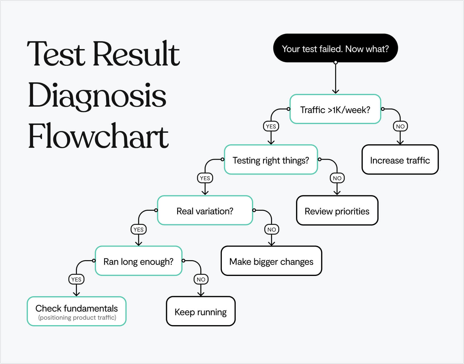
When tests keep failing (and what to do about it)
You've run 5 tests. All of them lost. What now?
Ask yourself:
Is your traffic too low?
Tests under 1,000 visitors/week often show false results. You're measuring noise, not signal.
Are you testing the wrong things?
If you're testing button colors while your value prop is unclear, you're rearranging deck chairs.
Are your variations actually different?
"Get Started" vs. "Sign Up" isn't a real variation. Test meaningfully different approaches.
Are you calling tests too early?
Reaching 95% statistical significance takes time. Stopping tests after 3 days means deciding on incomplete data.
When to stop testing and fix fundamentals:
If 5 consecutive tests fail or show <5% impact, you likely have bigger problems:
- Your positioning is wrong (wrong audience or unclear value)
- Your product isn't ready (no real differentiation)
- Your traffic is wrong (attracting people who will never convert)
Sometimes the answer isn't "test better." It's "build something people actually want."
A no-code test (ship it today)
Don't have a developer? No A/B testing tool set up? Here's a test you can run in the next hour.
The Manual CTA Test:
Step 1: Pick your highest-traffic page (probably homepage)
Step 2: Manually change your CTA copy
- Original: "Get Started" or "Sign Up"
- New version: "[Specific outcome]" (e.g., "See Your Dashboard")
Step 3: Make the change live (edit directly in your site builder)
Step 4: Track manually for 1 week:
- Note date/time of change
- Check GA4 daily: goal completions before vs. after
- Track: clicks on CTA, signups, rough conversion rate
What to look for:
Before: 100 clicks → 15 signups (15% CTA-to-signup)
After: 100 clicks → 22 signups (22% CTA-to-signup)
Result: +47% improvement
When to trust the results:
If you see a consistent 20%+ improvement across a full week, it's real. Ship it permanently.
Expected timeframe: 7-14 days for initial signal
Before you test anything, make sure your website isn't fundamentally broken
All the A/B testing in the world won't fix a value prop that says nothing or a product that's invisible before signup.
We help startups build websites that are worth testing:
- Value props that explain what you do
- Product screenshots above the fold
- Signup flows that don't ask for your life story
- Platforms that let you ship changes in hours, not weeks (Webflow, Framer)
Once the fundamentals work, testing makes sense. Until then, you're just optimising a broken funnel.
Learn more about our Web Design service →
Frequently Asked Questions
What is a good conversion rate for a startup website?
The median website-to-signup conversion rate for product-led SaaS is 3-6%. Top performers hit 18%. Anything below 2% signals problems with your website experience.
But here's what actually matters: your conversion rate is only "good" relative to where you started and what you're learning.
If you're converting at 2% today and hit 3% next month through systematic testing, that's a 50% improvement. That's good. If you're stuck at 5% because you stopped testing, that's not as good, even though 5% is technically above median.
Context matters:
- Traffic source: Organic search typically converts 2-3x better than paid ads
- Product complexity: Simple tools convert higher than complex enterprise software
- Price point: Free trials convert higher than paid-upfront products
- Audience awareness: Problem-aware visitors convert better than cold traffic
Is 3% a good conversion rate?
3% is exactly median for product-led SaaS startups. Not bad, not great.
Here's what this tells you:
- ✅ Your fundamentals probably work (value prop isn't completely broken)
- ✅ You're not actively repelling visitors with major issues
- ⚠️ You're leaving significant money on the table (top performers hit 6-18%)
- ⚠️ You haven't optimized systematically yet
What to do at 3%:
- Run the tests in this guide (start with signup form length)
- Watch 50 session recordings to identify friction points
- Segment by traffic source – you might be at 5% for organic and 1% for paid
Is 20% conversion rate good?
20% is exceptional for website-to-signup conversion. You're in the top 5% of product-led companies.
But before you celebrate:
Make sure you're measuring the right thing.
20% website-to-signup is rare and impressive. But some founders accidentally measure:
- Homepage visitors → clicks on CTA (not signups)
- Landing page visitors → demo requests (different funnel)
- Qualified traffic only → signups (skewed sample)
If you're genuinely at 20% website-to-signup:
- You've nailed product-market fit
- Your value prop is crystal clear
- Your traffic is highly qualified
- You're probably getting word-of-mouth or strong referrals
What to optimise at 20%:
- Focus deeper in funnel (signup-to-activation, activation-to-paid)
- Test your pricing page (that's where high converters often leave money)
- Scale your traffic acquisition (you've proven the funnel works)
Is 25% conversion rate good?
25% is extraordinary, if it's your website-to-signup rate. This typically only happens when:
- You're measuring a micro-conversion (not actual signups)
- Your traffic is pre-qualified (coming from webinars, demos, referrals)
- You're in a unique market (very specific niche with limited alternatives)
- You have incredibly strong product-market fit (people are actively searching for your solution)
Most startups at 25% are actually measuring:
- Landing page → trial start (not website → signup)
- Retargeting traffic → signup (warm audience, not cold)
- Pricing page → checkout (late-stage funnel, not top of funnel)
The reality check:
- Measure from all website visitors (not just landing page)
- Include all traffic sources (not just qualified channels)
- Track to completed signup (not just CTA clicks)
If you're genuinely at 25% across all traffic, you don't need this guide. You should be writing your own. 👏
Why is my conversion rate so low?
Low conversion (under 2%) typically means one of five problems:
1. Unclear value proposition
Visitors don't understand what you do in 10 seconds. Test: Show your homepage to someone who's never seen it. If they can't explain what you do, that's your problem.
2. Wrong traffic
You're attracting people who will never convert. Check: What keywords are driving traffic? Are they relevant to your product?
3. Broken user experience
Slow site, confusing navigation, forms that don't work on mobile. Check: Watch session recordings. Where do people get stuck?
4. Hidden product
Generic imagery instead of actual screenshots. Jargon instead of clear outcomes. Mystery instead of transparency.
5. Excessive friction
8-field signup forms. Requiring credit cards for free trials. Asking for company details before showing value.
How to diagnose: Watch 50 session recordings in Microsoft Clarity. The problem will become obvious.
How long does it take to improve conversion rate?
Fixing fundamentals: 1-2 weeks (clear value prop, speed up site, reduce signup fields)
First meaningful test: 2-4 weeks (includes planning, building, running for statistical significance)
Seeing consistent improvement: 3-6 months of systematic testing (running 2-4 tests per month)
Becoming best-in-class: 12+ months of disciplined experimentation
The startups that go from 2% to 6%+ don't do it with one magic test. They run 20+ experiments, learn from failures, and compound small wins.
If you're expecting to double your conversion rate in a month, you'll be disappointed. If you're willing to improve 10-15% per quarter through consistent testing, you'll be thrilled with the results.
What should I test first on my website?
Start with the highest-impact, lowest-effort test: signup form length.
Reduce your form from 5-8 fields down to email only (or email + password).
After that, follow this order:
- Value proposition clarity (if visitors don't understand what you do)
- CTA copy (change generic to outcome-focused)
- Product visibility (add actual screenshots above the fold)
- Social proof placement (move logos near CTA)
Use the ICE framework (Impact × Confidence × Ease) to prioritise based on your specific situation.
How do I know if my A/B test reached statistical significance?
Most A/B testing tools (Google Optimise, VWO, Optimisely) calculate statistical significance automatically and will notify you when a test is conclusive.
Three criteria for a valid test:
1. Sufficient sample size
Use an A/B test calculator to determine how many visitors you need based on your baseline conversion rate and desired minimum detectable effect.
2. Adequate time duration
Run tests for at least 2-4 weeks (multiple business cycles) even if you hit sample size earlier. This accounts for day-of-week variations and external factors.
3. Statistical significance of 95%+
Don't call tests at 75% or even 90% confidence. Wait for 95% (p-value of 0.05 or less) to ensure results aren't due to random chance.
Common mistake: Calling tests too early because early results look promising. This leads to false positives where your "winning" variant actually loses when exposed to more traffic.
Be patient. Bad data is worse than no data.
Can I test multiple things at once?
No, not in the same A/B test.
A/B testing isolates one variable so you can understand what caused the change. If you test a new headline AND new CTA copy AND new images simultaneously, and conversion improves, you have no idea which change drove the lift.
What you CAN do:
- Run separate A/B tests on different pages simultaneously (test homepage value prop AND pricing page social proof)
- Run sequential tests on the same page (test value prop this month, CTA next month)
- Use multivariate testing if you have massive traffic (>50,000 visitors/week)
What you CANNOT do:
- Change multiple elements in one A/B test and expect to learn anything
- Run overlapping tests on the same page (they'll contaminate each other)
Start simple. Test one thing. Learn what works. Move to the next test.
What if I don't have enough traffic to run A/B tests?
If you're under 1,000 visitors per week, formal A/B testing will take too long to reach statistical significance.
What to do instead:
1. Fix obvious problems first
You don't need A/B tests to know that:
- An 8-second load time needs fixing
- An 8-field signup form needs reducing
- A vague headline needs clarifying
2. Use qualitative research
- Watch session recordings (see where users struggle)
- Run user interviews (ask what's confusing)
- Use Loom to record your site and ask 10 people for feedback
3. Make bold changes and measure directionally
Change your value prop completely. Wait 2 weeks. Did conversion improve? This isn't statistically rigorous, but it's better than changing nothing.
4. Focus on driving more traffic
SEO, content marketing, paid ads. Once you hit 1,000+ visitors/week, systematic testing becomes viable.
Low traffic is a reason to be more aggressive with changes, not more conservative. You can't hurt what's already not working.
Should I test on mobile and desktop separately?
Yes, if mobile represents >30% of your traffic and you suspect device behavior differs significantly.
Why this matters:
We've seen tests win +30% on desktop while losing -5% on mobile. Long copy works on desktop. Concise copy works on mobile. If you only look at aggregate results, you'll miss this.
How to test by device:
- Check your analytics—what % of traffic is mobile vs. desktop?
- Check conversion rates by device—is there a big gap?
- If mobile is >30% and converts differently, run device-specific tests
- Or design separate experiences from the start (responsive isn't always enough)
When to skip device segmentation:
If mobile is <20% of traffic, optimize for desktop first. Once that's working, adapt for mobile.
How do I convince my team/boss that testing is worth it?
Show the math:
Current state:
- 10,000 monthly visitors
- 2% conversion rate
- 200 signups/month
- 10% of signups become paid customers
- 20 new customers/month
- $100 average monthly revenue per customer
- $2,000 MRR from website
After improving conversion to 4% through testing:
- Same 10,000 monthly visitors
- 4% conversion rate (achievable in 3-6 months)
- 400 signups/month
- 10% become paid customers
- 40 new customers/month
- $4,000 MRR from website
Result: +$2,000 MRR. $24,000 additional ARR. From the same traffic.
Then show the investment:
- Free tools (Clarity, GA4, Google Optimize)
- 5-10 hours per month running tests
- 3-6 months to double conversion
ROI: Massive, with near-zero cost.
Most teams don't resist testing once they see the numbers. They resist because they've never seen someone do the math.
What's the difference between conversion rate optimization (CRO) and A/B testing?
A/B testing is a methodology—a specific way to compare two versions and determine which performs better.
Conversion rate optimization (CRO) is the broader goal—improving the percentage of visitors who take desired actions.
CRO includes:
- User research (understanding why people don't convert)
- A/B testing (validating which changes improve conversion)
- Qualitative analysis (session recordings, user interviews)
- UX improvements (site speed, mobile optimization, accessibility)
- Content optimization (clearer copy, better imagery)
A/B testing is one tool in the CRO toolkit. You can improve conversion without A/B testing (fix obvious problems). But systematic A/B testing is the most reliable way to know what actually works.
When should I stop testing and just redesign?
Redesign when:
1. Your tech stack is fundamentally broken
Your site is built on outdated technology that makes testing impossible or your design system is so rigid that testing requires rebuilding each time.
2. Your brand has completely changed
You pivoted. Your positioning is different. Your audience is different. A redesign signals the change.
3. You've tested for 6-12 months and validated what works
Now you're redesigning based on learnings, not assumptions. This is smart.
Don't redesign when:
- You're frustrated that tests aren't winning fast enough
- You think "it just needs to look better"
- You haven't tested systematically yet
- You're guessing at what users want
Most startups redesign too early. Test first. Learn what works. Then redesign to lock in those learnings at scale.


