


The median SaaS product activates only 38% of new users; meaning 62% sign up, poke around, and never come back.
And the most common reason customers give for leaving is "poor onboarding or slow time-to-value", how long it takes a new user to experience the actual benefit of your product, not just sign up for it.
What’s standing between your product and a customer who sticks around is very often the screen they land on right after signup: your dashboard.
At Lumi Studio, we’ve spent the last decade helping startups whose products now reach 50M+ users, and we see this all the time. Founders pour months into the feature that's supposed to change everything, then ship it behind a dashboard that hasn’t been properly designed.
This is a breakdown of nine dashboard mistakes quietly costing you activated users, exactly how to fix each one, and a framework for auditing your own dashboard this week.
In short: The most common SaaS dashboard mistakes are collectively the biggest lever early-stage teams have over churn: a blank empty state, information overload, generic one-size-fits-all layouts, context-free metrics, misleading charts, slow perceived load times, notification fatigue, poor accessibility, and hard-to-cancel flows.
Key takeaways
- The median SaaS product activates only 38% of new users
- Poor onboarding / slow time-to-value is the #1 named cause of SaaS churn
- Cap your primary dashboard view at 5-8 metrics. More than that exceeds what most people can hold in working memory at once
- Small, high-confidence fixes usually beat a full redesign. Score your options with the RICE framework before committing a quarter to a rebuild.
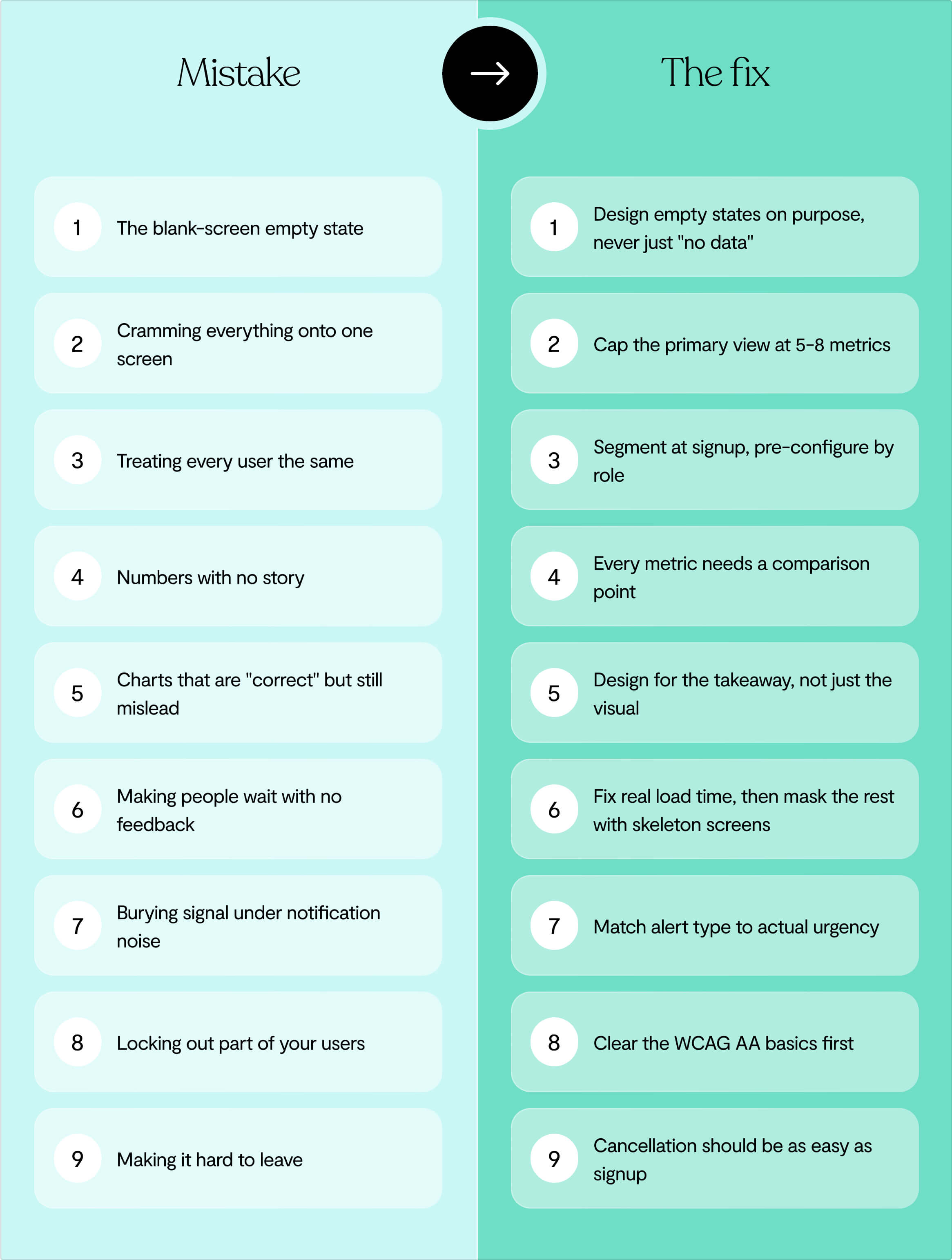
9 SaaS dashboard mistakes, at a glance
Why your SaaS dashboard isn't the product
A new trial user who opens your product on day one and sees a clean, well-designed number on screen (a score, a completion percentage, whatever it is) has technically been shown data.
But if nothing tells them what that number means or what to do next, they haven't been helped. They've just been handed a new problem to figure out.
Users don't want a better view of the problem, they want the problem gone
Picture one of your own users, say, someone using your product to track overdue invoices.
A beautifully designed chart of which invoices are late doesn't solve their problem. It just shows the problem to them more clearly. But what they want is fewer late invoices, or at minimum a clear next step to chase one down.
So many SaaS dashboards answer "can the user see what's happening?" when the real question is "does this get them closer to what they're trying to achieve?"
Your users already have too many numbers in their life. A louder smoke alarm doesn't put out the fire.
So one more well-designed chart doesn't fix that, unless it also points at an action.
Are SaaS dashboards dead? No, they're just asked to do too much
SaaS dashboards end up doing three different jobs on one screen:
- Communicate a handful of key numbers at a glance
- Let people explore and dig through raw data
- And produce something formal enough to export into a report.
But data analysis and data communication are different things. A dashboard's true job is narrow: communicate a small number of things clearly and fast.
The moment it also has to double as your exploration tool and your reporting suite, it stops doing any of the three well.
Are AI agents replacing SaaS dashboards?
Product teams are shifting from a pull model (a human has to remember to open the dashboard) to a push model (the system monitors and surfaces what matters without being asked).
This is why:
- Dashboards are inherently backward-looking, showing what already happened rather than what's happening now
- Attention is scarce, so in orgs running a dozen dashboards, real signals get missed simply because nobody checked the right one that day
- And a chart shows that something changed without explaining why, leaving the interpretation work to the human regardless of how good the visualization is.
That doesn't make dashboards obsolete, but it's a strong argument for treating alerts, digests, and in-context nudges as part of the same system as the dashboard itself.
Before you touch a pixel: commit to the one decision or action your dashboard exists to drive. If you can't answer that in a sentence, you’re setting yourself up for dashboard failure. ⚠️
The 9 SaaS dashboard mistakes costing you users
1. The blank-screen empty state
A new user signs up, and the first thing your product shows them is nothing: an empty table, a "0" where their results should be, no context, no next step.
This usually happens because teams build for the populated state and treat day one as an edge case, rather than the first real impression most users will ever form.
But an empty dashboard reads as broken, at the very moment someone is deciding whether your product works for them.
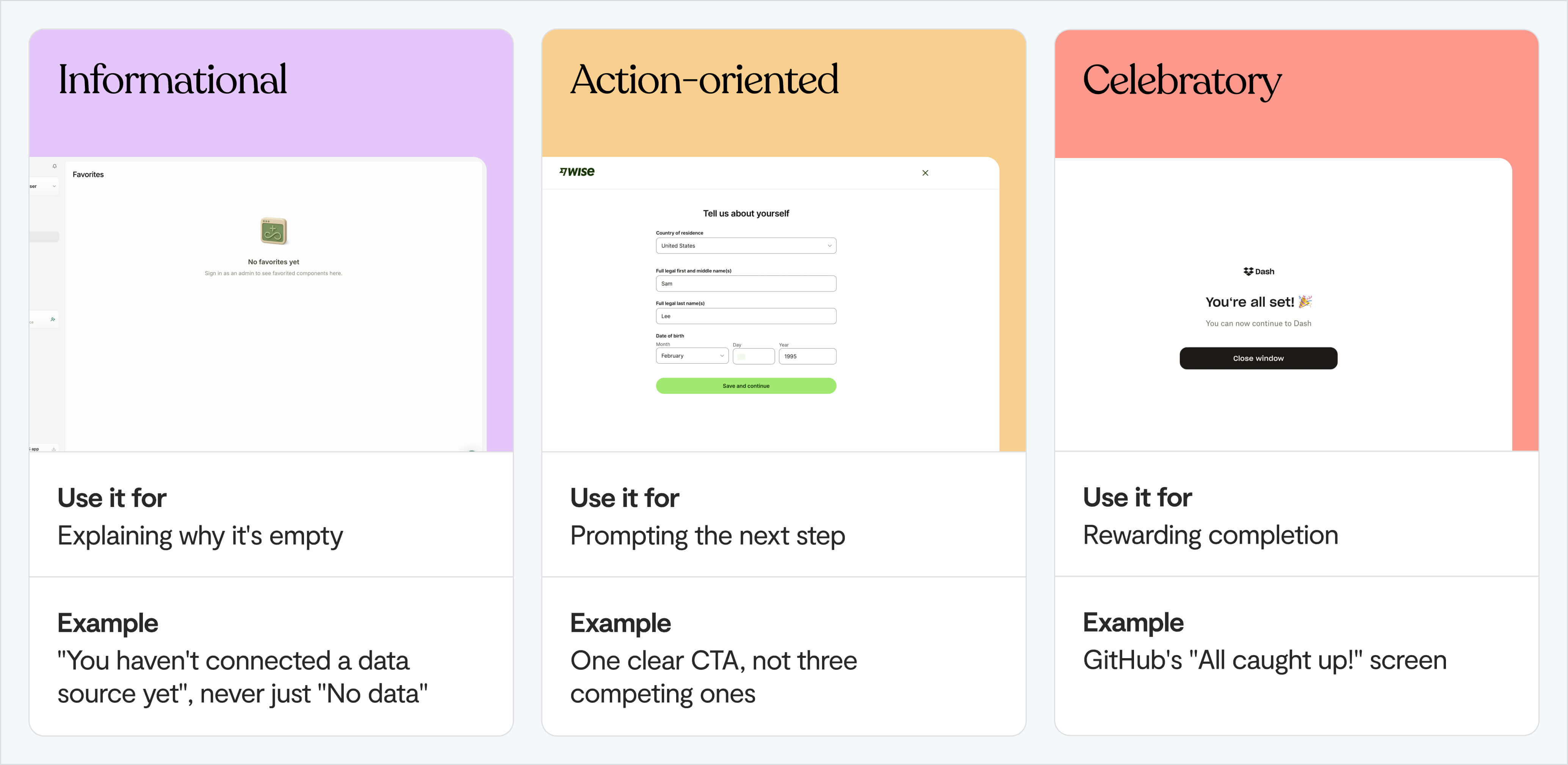
There are three types of empty state to design for:
2. Cramming everything onto one screen
Every metric your team has ever tracked ends up on one page, with equal visual weight.
That's a problem, because people can reliably hold about 7±2 items in working memory at once.
A dashboard with 20 widgets is asking users to do something the human brain just can't do: users identify 2-3 important numbers within about 10 seconds, and the abandon-or-stay decision is largely made in the first 10 seconds too.
Fixing this comes down to three things:
- Limit the primary view to 5-8 metrics, maximum
- Give one metric more visual weight than everything else. This is the Von Restorff effect: a single element that stands apart is disproportionately more likely to get noticed and acted on
- Move everything else one click away, not off the product entirely
3. Treating every user the same
SaaS products tend to ship a single, generic dashboard layout for every signup, regardless of role, goal, or experience level. Which is understandable, because building one dashboard is easier than building several.
But 65% of customers now expect onboarding personalised to their role or goals. So personalised onboarding paths lift completion by 35%, and role-based playlists lift it by 41%.
Fixing this comes down to three steps:
- Ask 2-3 skippable questions at signup: role, experience level, primary goal. Keep it short: each additional signup field costs roughly 11% conversion on average.
- Pre-configure a baseline dashboard per role, instead of handing over a blank canvas to customise.
- Let people customise further, or switch views, once they're past onboarding, don't force the decision upfront.
💡 We wrote a much deeper resource on this in our guide to PLG onboarding.
4. Numbers with no story
❌ "Total sales last month: 246."
No comparison, no trend, no goal to measure against. It's technically a number, but it isn't information.
It’s not a good idea to fill a dashboard with vanity metrics either, like follower counts, raw page views, total downloads. They look impressive but don't answer the only question that matters: can I use this to make a decision?
Here’s how to decide which metrics are actionable:
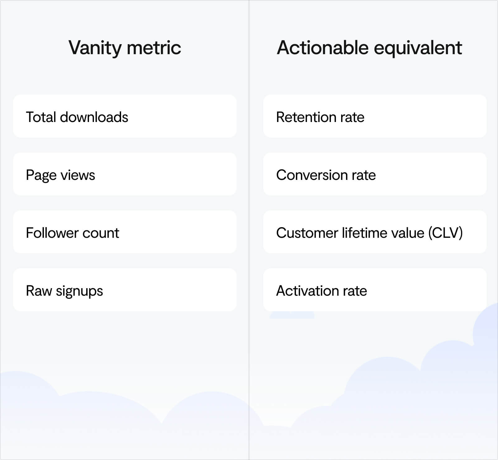
Every number on the dashboard needs a comparison point (versus last period, versus a goal, versus a benchmark). Every key metric should point toward a next action, not just a state.
5. Charts that are "correct" but still mislead
A chart can follow every best practice and still lead users to the wrong conclusion. If the chart is right but the takeaway isn’t, then the work is not finished.
There are five ways this happens:
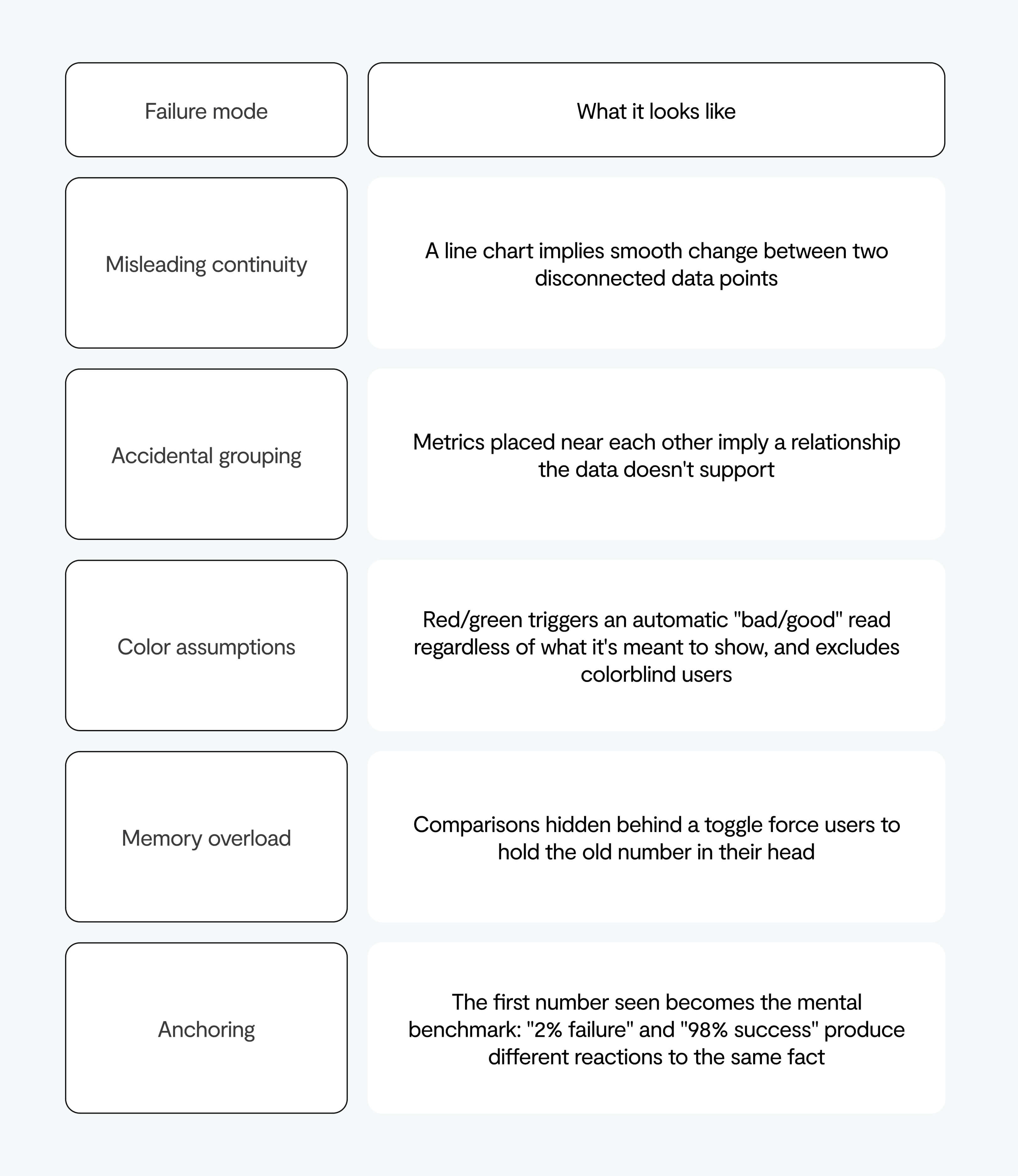
Before shipping a chart, ask what decision it's supposed to inform, not just whether it looks clean.
6. Making people wait with no feedback
Slow loads, frozen screens, no indication that anything is happening: it’s all bad news for your conversion rate ⬇️
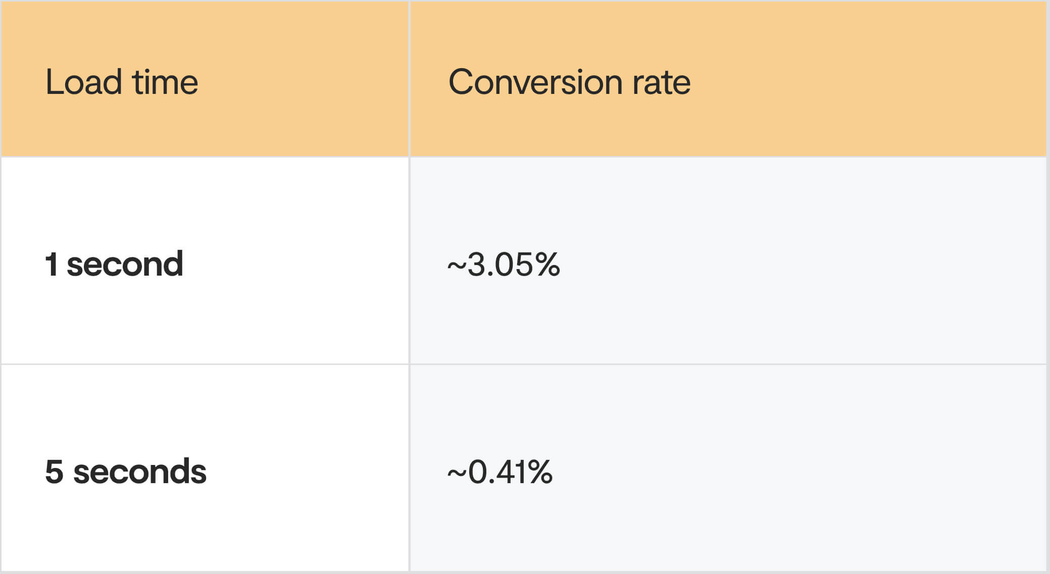
Making people wait with no feedback
Every additional 100ms of delay costs about 1% in conversions. On mobile, 53% of visits are abandoned once load time passes 3 seconds.
Fixing this means:
- Fix actual load time first: lazy loading, image compression, query optimization
- Add skeleton screens for anything that can't be instant. They don't make anything load faster, but they change perceived wait time, which is what drives abandonment. Keep them neutral in color, add subtle motion, and shape placeholders to mirror real content
- Never leave a frozen or blank screen with zero feedback, it's indistinguishable from broken
7. Burying signal under notification noise
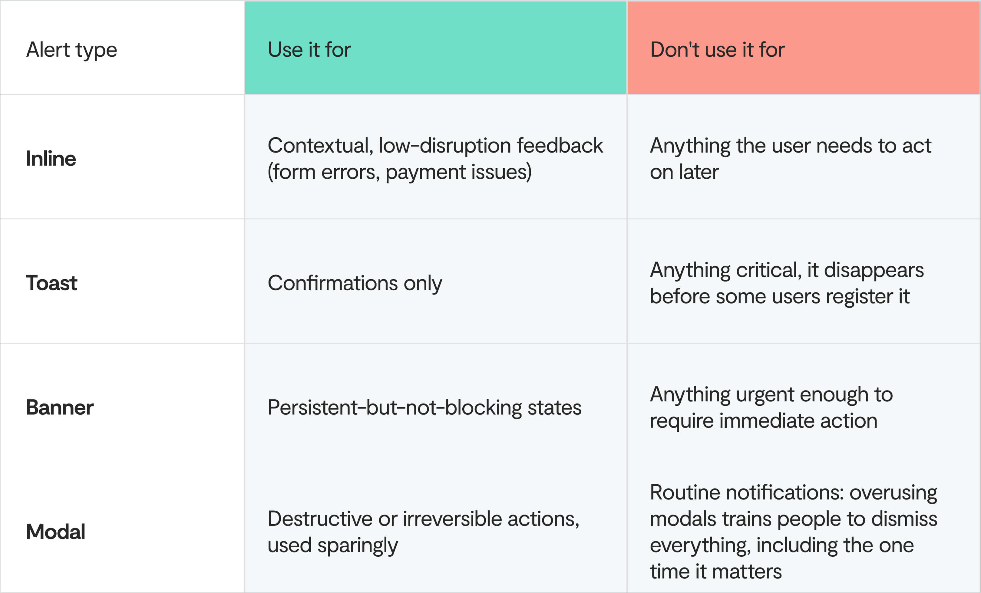
Every event triggers an alert, until users can't tell what's truly urgent, so they stop looking at any of it, or disable notifications entirely.
It doesn't help that the average smartphone user already gets up to 46 push notifications a day: your product is competing for attention it's unlikely to win.
So, use a real hierarchy, matched to real urgency:
8. Locking out part of your users
1.3 billion people globally live with a disability, controlling an estimated $490 billion in disposable income in the US alone.
So your low-contrast text, no keyboard navigation, color-only status indicators, and no screen reader support can be a big problem.
Start by fixing these:
- Contrast: 4.5:1 for normal text, 3:1 for large text and interactive elements
- Alt text on every meaningful image and icon, and labels on every form input
- Full keyboard navigation, including custom components like dropdowns and modals, which frequently ship without keyboard handling
- Visible focus states on every interactive element
- ARIA labels on custom components so screen readers understand state changes
- Error messages that don't rely on color alone
Run axe DevTools against your core screens, then do one full pass of your main workflow using only a keyboard.
9. Making it hard to leave
Burying the cancellation flow, guilt-tripping the decline option ("No, I don't want to save money"), or auto-renewing without clear notice?
These tactics can look like they're working short-term, with conversion or retention numbers ticking up.
But long-term, they produce a damaging type of churn: users who feel trapped, cancel loudly, take support tickets and bad reviews with them, and warn other people not to sign up in the first place.
This is especially urgent now: the FTC's click-to-cancel rule requires cancellation to be exactly as easy as signup.
So make cancellation genuinely as easy as signup. It protects your word-of-mouth, and it's the law.
What a good SaaS dashboard looks like
Invert each of those nine mistakes and they become a spec. Use it as a self-check against your own dashboard, or hand it to whoever's building the next one.
- A deliberate empty state that explains, prompts, or celebrates, never a blank screen
- 5-8 metrics on the primary view, one of them visually dominant, everything else one click away
- A default view that matches the user's role, chosen from 2-3 signup questions, not identical for everyone
- Every number paired with a comparison (versus last period, versus a goal) never a number in isolation
- Charts chosen for the decision they inform, not for how they look in a screenshot
- Feedback on every wait – a skeleton screen at minimum, real performance work behind it
- Alerts sized to their actual urgency, with a hard rule against modals for anything routine
- WCAG AA as a baseline, not a retrofit after a complaint or a lawsuit
- A cancellation flow exactly as easy as the signup flow
How to audit your dashboard this week
Here's a sequence you can run in a week:
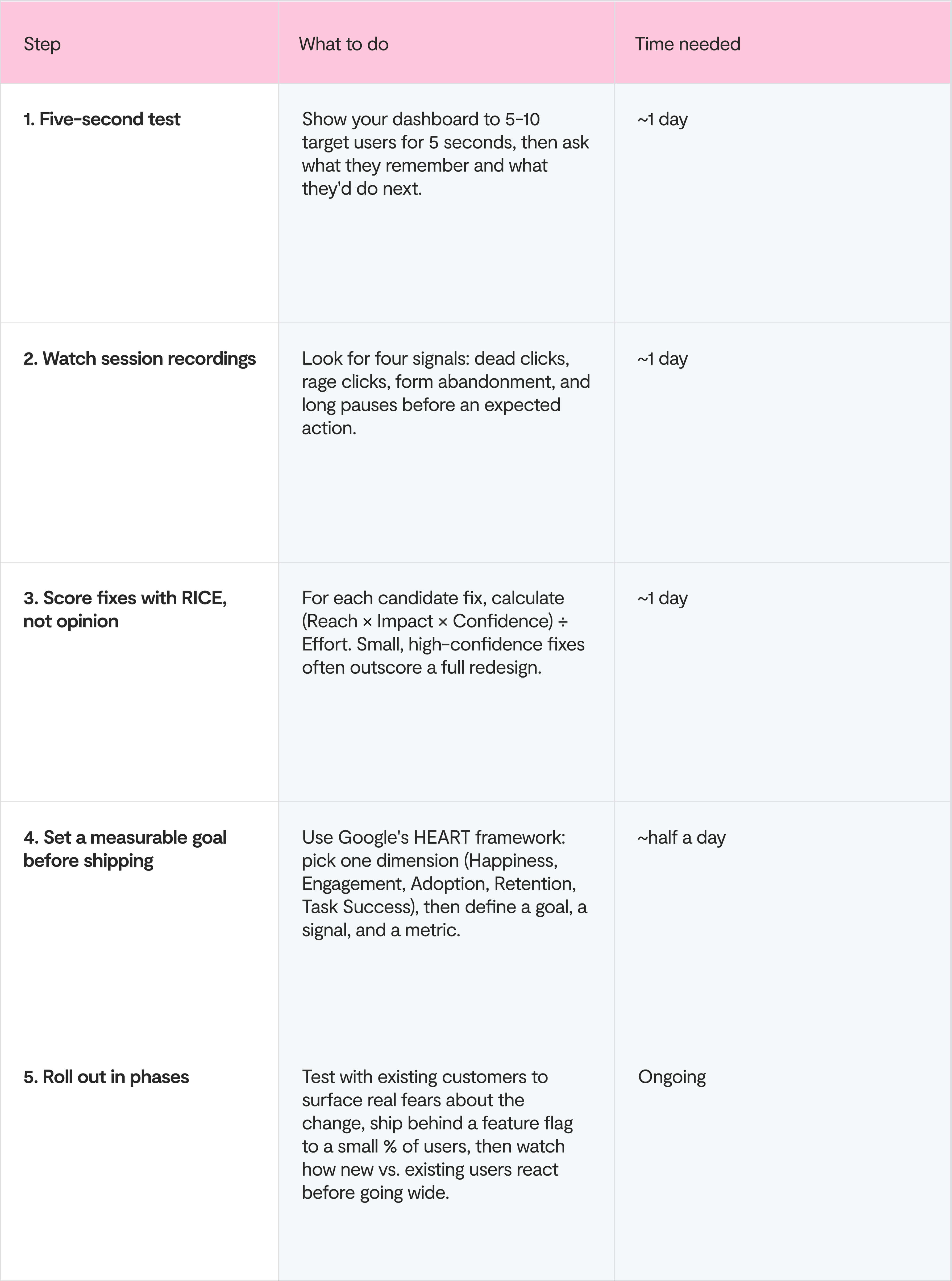
Free or near-free tools to run this with, if you don't have a design or research budget yet:
- Lyssna and Maze both support five-second testing on a free or low-cost plan
- Microsoft Clarity is free, unlimited session replay and heatmaps
- PostHog has a generous free tier that covers replay, feature flags, and product analytics in one tool
If you're pre-product-market-fit, don't do all of this yet
Everything above assumes you have users churning for reasons you can already see in the data.
If you're pre-PMF, sub-100 active users, still finding out whether anyone wants this at all, the majority of this list is premature. A polished empty state and a WCAG-perfect dashboard don't matter if you haven't confirmed anyone wants the product underneath them.
The order that holds up Pre-PMF:
- Talk to users directly before you touch the UI. If people are dropping off, a five-minute customer interview will usually tell you more than a heatmap. You need to know why, and early-stage sample sizes are too small for quantitative tools to be reliable yet.
- Fix mistake #1 (empty states) and mistake #2 (information overload) first, and stop there.
- Defer accessibility polish, alert hierarchy, and chart sophistication until you have enough users and enough usage data for those investments to pay back.
- Re-run this whole list once you hit product-market fit signals. Retention curves flattening, organic referrals, users upset when the product goes down. That's when a dashboard's design starts determining your growth rate instead of your survival.
A common mistake is that teams that spend a design sprint perfecting dashboard polish before they've validated anyone wants the underlying product. Sequencing matters as much as the fixes themselves.
(We go deeper on sequencing UX work at every stage in our guide to implementing good UX in an early-stage startup.)
Final thoughts
Every mistake on this list comes down to one thing: treating the dashboard as the goal, instead of a tool to reach one. And that comes through relentlessly asking one question: what should this screen make someone do? Then cutting everything that doesn't answer it.
If you're staring at a dashboard that's grown into something nobody quite planned, and you want a second pair of senior eyes on it before you commit a quarter to redesigning it, book a free 30-minute dashboard review with a Lumi co-founder.