


Hiring a UX designer when you've never done it before is a strange experience.
You look at portfolios, you feel reactions – strong ones, sometimes – and then you realise you have almost no basis for the reaction other than "this looks good."
Which is a reasonable thing to feel. It's just not a reliable way to hire.
We've sat in enough of these processes, on both sides, to know where it goes wrong. Because design is one of the few disciplines where the output is so visible that it obscures everything that actually matters about the person who made it.
Here's exactly how to hire a UI/UX designer. ⬇️
First: know what you're actually buying
UX design and UI design are different jobs. This sounds obvious until you're writing a job description at midnight and you put "strong UX and UI skills required". You want someone who can do it all, which is what most early-stage startups want, because headcount is expensive.
That's fine, it’s just crucial to be clear on what the priority is.

UX vs. UI – the difference
UX is about how the product works.
- The logic of how users move through your product
- Where they get confused
- Where they abandon
- How information is structured
- Whether the right things happen when a user does the expected thing.
UX is fundamentally a problem-solving discipline, closer to systems thinking than to visual craft.
UI is about how the product looks.
- Typography
- Colour
- Components
- Visual hierarchy
- Spacing
- Interaction details
UI is where brand lives inside a product. It's what determines whether your product feels polished or cobbled together.
The dirty secret of early-stage startups is that UX matters far more than UI, especially pre-product-market fit – but UI is what's easier to see, so founders often over-weight it.
A product with mediocre visuals but excellent flow will almost always outperform a beautiful product with a confusing experience. Users will tolerate plain, but they won't tolerate broken.
What to prioritise at each stage
- Pre-product-market fit: Prioritise UX depth. Getting the flows right, the logic tight, and the onboarding working matters more right now than whether your buttons look beautiful.
- Post-PMF, scaling: UI becomes more important. You've validated the flows. Now it's time to raise the visual standard and build a consistent system your dev team can work from.
- Need both? You're hiring a product designer, someone who does both reasonably well, usually with a stronger lean to one side. That person exists, but be honest about which side you need them to lean toward.
Knowing this before you start evaluating will change who you look at and what you ask them.
→ See how we approach UX design for early-stage startups

The mistake: hiring on aesthetics instead of thinking
When a founder evaluates a designer for the first time, they almost always do the same thing: look at the portfolio, decide if they like how it looks, and use that as the primary signal.
Aesthetics are legible, you know when something looks good. You don't need training to have a reaction to visual work.
But that reaction is close to useless as an evaluation signal.
Visual style is context-dependent: a portfolio that looks stunning for a fintech app might be completely wrong for a B2B SaaS tool used by accountants at 9am.
More importantly, the way a product looks has almost no relationship to the quality of the thinking behind it. We’ve seen beautiful portfolios from designers who couldn't explain a single decision they made, and I've seen rough-looking portfolios from designers who turned out to be exceptional product thinkers.
What you're actually evaluating is how a designer thinks. The portfolio is the entry point to that conversation.
➡️ The portfolio is the invite to the audition, not the audition itself. The screens tell you what they made, the conversation tells you whether you should hire them.
→ We send a monthly newsletter with exactly this kind of thinking – practical UX and product insights for startup founders. Subscribe to UX for Startups if that's useful.
What the interview is for, and the 5 questions to ask
The interview isn't where you learn about their skills. You've already started evaluating those from the portfolio.
💡 The interview is where you pressure-test the things the portfolio can't show you: how they think in conversation, how they handle uncertainty, and whether they're actually honest about their work.
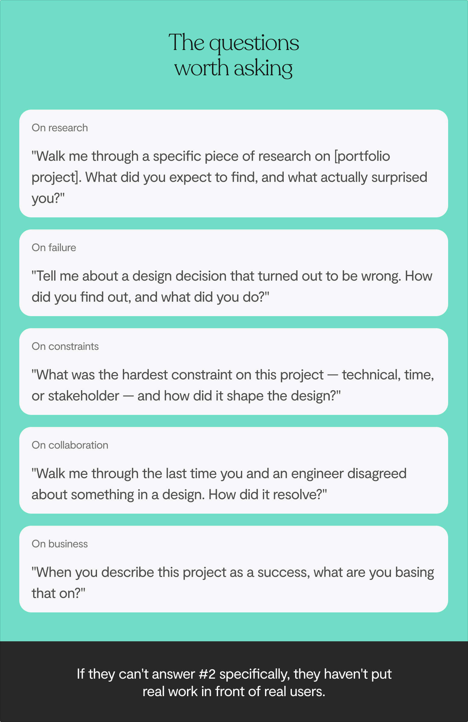
The questions worth asking
On research
"Walk me through a specific piece of research you did on [project in their portfolio]. What did you expect to find, and what actually surprised you?"
A designer who did real research will have a specific answer.
On failure
"Tell me about a design decision you made on this project that turned out to be wrong. How did you find out it was wrong, and what did you do?"
This simultaneously tests self-awareness, their relationship with feedback, and whether they've ever actually put their work in front of real users.
On constraints
"What was the hardest constraint you were working under in this project – technical, time, or stakeholder – and how did it affect the design?"
Real design work always happens under constraints. A designer who can't name one either hasn't faced real constraints or isn't being honest with you.
On collaboration
"Walk me through the last time you and an engineer disagreed about something in a design. What was the disagreement, and how did it resolve?"
Watch for candidates who describe engineers as obstacles to the design, or who describe every disagreement as one they eventually won. That's a collaboration style that creates friction fast in a startup.
On business outcomes
"When you describe [specific project] as a success, what are you basing that on?"
A lot of designers struggle with this. They'll describe the design as successful because it looked good or users said nice things, without connection to whether it moved the business forward.
The difference between junior, mid-level, and senior designer
Founders often write job descriptions for senior designers because that's who they'd prefer, without being honest about what a senior designer actually requires from the organisation in return.
A senior designer needs a context where senior judgment can actually be exercised. If you're pre-PMF with no clear user, no data, and a product that changes shape every two weeks, hiring a senior designer and treating them like a junior executor will end badly for everyone.
Junior designers (0–2 years)
- Understand the design process but haven't executed all of it independently
- Need guidance and oversight on research and decision-making
- Lean heavily on more senior input for anything strategically complex
What you're evaluating here is mostly learning velocity and attitude.
Can they absorb feedback quickly? Do they understand why they're making decisions, even if someone else is shaping those decisions?
The tools and frameworks can be taught. The ability to think can't.
Mid-level designers (2–5 years)
- Own a project from start to finish without hand-holding
- Run their own research and present work without a senior designer in the room
- Manage competing feedback from multiple stakeholders without losing the thread
At this level, process documentation and decision rationale become non-negotiable. If a mid-level designer can't articulate why they made specific choices, they're operating at junior level regardless of their years on a CV.
Senior designers (5+ years)
- Find problems worth solving, not just solve problems handed to them
- Talk to investors, customers, and engineers with equal fluency
- Build and govern a design system, not just use one
- Raise the bar on the team around them
Years of experience is a proxy, not a measure. The seniority framework is a starting point, what you're actually evaluating is the quality of thinking, not the quantity of time.
B2B vs. consumer vs. enterprise
Where a designer has spent most of their career matters more than most founders check for.
B2B SaaS
Your users execute the same workflows every day, sometimes dozens of times. The design bar is efficiency, not delight. Your designer needs to think about:
- Information density and keyboard shortcuts
- Bulk actions and power user shortcuts
- The way users build muscle memory for interfaces over time
Consumer products win on first impressions, but enterprise software lives or dies on whether it helps someone do their job faster on the thousandth use. A designer who's spent their career on consumer apps will often build B2B products that look great and feel frustratingly slow to use at scale.
Consumer / B2C
Your users have no obligation to stay and no training department to keep them around. The design priorities shift entirely:
- First-impression clarity and emotional resonance
- Onboarding that reduces friction in the first 60 seconds
- Micro-moments that create habit and return
A designer with a pure B2B background will often build consumer products that are too dense, too feature-heavy, and ask too much of a user who just wants to accomplish one thing quickly.
Enterprise
The person who buys your product is usually not the person who uses it daily. Your designer needs to serve both:
- The executive who evaluates ROI
- The administrator who configures the system
- The end user who lives in it for eight hours a day
Enterprise UX success is measured by productivity, accuracy, and error reduction, not engagement or delight. Designers who don't know that will optimise for the wrong things.
The question to ask every candidate
"How does your approach change when you're designing for users who use the product ten times a day versus users who use it once a week?"
The answer tells you immediately whether they've thought about context-dependent design or whether they apply the same framework everywhere.
The test task: the most important part of your process
A portfolio plus an interview is not enough to make a confident design hire. The portfolio shows you what the designer chose to show you. The interview shows you how they perform when they know they're being evaluated.
What you actually need to see is how they work when the brief is messy, the timeline is real, and nobody has prepared them for what's coming.
How to run a good test task
- Use a real problem from your actual product, not a hypothetical scenario. Real problems have real constraints and real history, which means the response tells you something real.
- Build in deliberate ambiguity. Don't over-specify what you want. Give them the problem, some context, and a realistic timeline. Then watch what they do with it.
- Keep the scope tight. One user flow or one specific problem. Not "redesign our app."
- Pay for it. Serious designers won't do unpaid work assessments. If you make the test task unpaid, you screen out exactly the candidates you want most.
What to look for in the output
- Do they ask clarifying questions before starting? The most revealing moment is what they do in the first hour. A designer who dives straight into Figma is telling you they execute before they understand. A designer who comes back with sharp, precise questions (not to delay, but because the questions are genuinely necessary) is showing you how they think.
- Did they document their assumptions? Not just the solution, but the reasoning that produced it.
- How did they handle constraints? Did they acknowledge them, work around them, or pretend they didn't exist?
- How do they respond to feedback? Both extremes are red flags. Immediate capitulation on everything means they don't own their decisions. Refusing to update on anything means they can't collaborate. You want someone who holds their ground when the reasoning is good and updates when it isn't.
- Can they explain what they chose not to do? This is often more revealing than what they did do.
The red flags that predict a bad hire
After enough of these processes, you start to recognise patterns. Here are the ones we take most seriously.
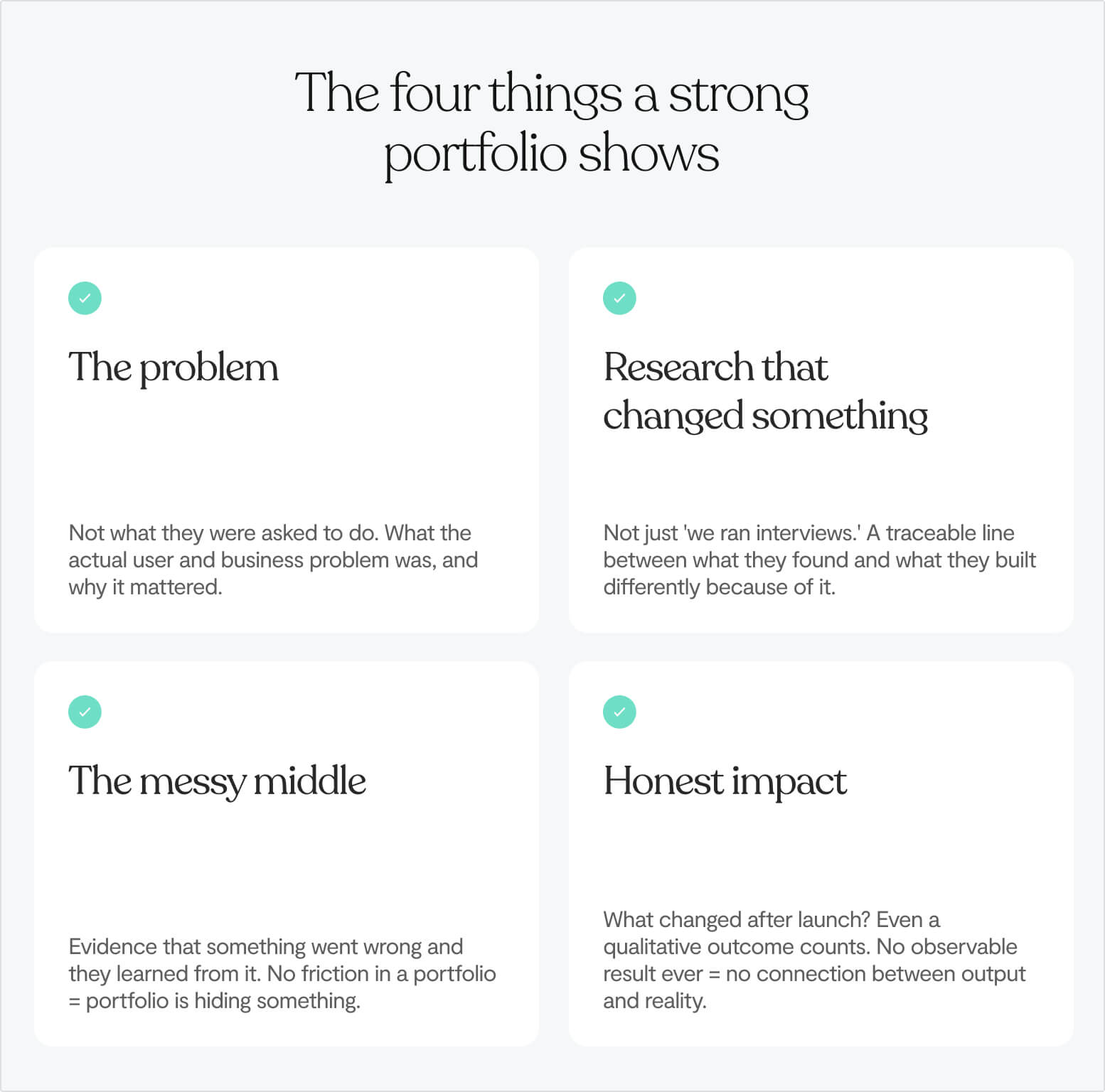
🚩 A portfolio with no process
Only polished final screens. No research, wireframes, or iteration artefacts.
If you can't see how the work got made, you cannot evaluate the thinking behind it.
🚩 Metrics without numbers
"Improved user engagement." "Increased retention." "Reduced churn."
These phrases mean nothing without a baseline, a comparison, and some account of causality.
Press every claim: what was the number before? What was it after? If they can't answer, the metric was decorative.
🚩 A perfect track record
Every project succeeded. Every stakeholder was delighted. Every user test was positive.
Real design work involves wrong turns, revised briefs, failed assumptions, and compromises. A portfolio with no friction in it is a portfolio that's hiding something.
🚩 Template thinking
Every project follows the same arc: research → insights → wireframes → final design.
When the process is more important than the thinking, you get a designer who can perform a methodology without necessarily reaching the right outcome. The best designers adapt their process to the problem – doing very little research when there's already enough evidence, doing weeks of it when the problem space is genuinely unknown.
🚩 Framing engineers as approvers
When a designer describes the rest of the team as people who review and sign off on their work, they're revealing something about how they understand their role.
Design at a startup is a team sport. The designers who add the most value make the people around them better, not the ones who treat everyone else as implementors of their vision.

AI fluency
Figma's 2025 research found that 85% of designers believe working with AI will be essential to their future success. Hiring managers are explicitly prioritising candidates who can integrate AI tools into their workflows.
But the question isn't whether a designer uses AI. The question is how.
The right way to use AI in design
- Generating multiple variants in minutes instead of hours
- Filling placeholder content instantly so prototypes feel real
- Speed-running through early ideation to get to the interesting problems faster
- Automating repetitive tasks in design systems
The wrong way
- Using AI to skip the thinking that produces good design
- Generating outputs that look coherent but are fundamentally shallow – because AI doesn't know your users, your constraints, or what matters about your specific problem
There's a difference between a designer who uses AI to go faster and a designer who uses AI to avoid going deep. The former is a genuine advantage, the latter produces work that looks fine in a presentation and falls apart in production.
Ask every candidate: "Where in your process do you use AI tools, and where do you deliberately not use them?"
A designer who can answer that with specifics – "I use it for X but I don't use it for Y because that's where the real judgment lives" – has thought carefully about this.
A simple scoring framework to stop hiring on gut feel
Use a scorecard. Score each dimension 1–4, and require written evidence for every score, not just a number.
Portfolio review
- Depth of process documentation
- Evidence of research that changed something
- Clarity of problem framing
- Observable outcomes, however modest
Interview
- Specificity and honesty in answers
- Ability to explain why, not just what
- Response to questions about failure or compromise
- Business outcome awareness
- How they describe collaboration with engineers and PMs
Test task
- Quality of clarifying questions before starting
- Reasoning documented alongside output
- How they responded to feedback
- Output quality relative to the constraints they were given
A scorecard doesn't eliminate judgment. It gives your judgment structure, and it gives you something to compare across candidates that isn't just vibes.

What you're actually hiring for
You're not hiring someone to make your product look good. You're not hiring someone to run workshops and produce wireframes. Those are outputs.
What you're actually hiring is a person who thinks in user problems and can connect those problems to outcomes your business cares about.
The visual craft, the tool proficiency, the process knowledge – all of that is in service of the thinking. When you evaluate with that frame, every part of the process gets clearer:
- The portfolio question you're asking isn't "does this look good?" It's "can I see evidence that this person understood the problem before they tried to solve it?"
- The interview question isn't "what's your process?" It's "what happened when your process gave you an answer you didn't expect?"
- The test task question isn't "is the output good?" It's "can I see how they think when nobody is watching?"
Every step is asking the same underlying question: is this someone who thinks, or someone who executes?
At a startup, the right answer is almost always someone who can do both, but who leads with thinking.
→ If that last bit made you wonder where design ends and product management begins, our article on Product design vs product management is worth reading next.
Lumi is a product design studio for tech startups. We've helped 50+ startups design and build digital products, with over $1.4B in combined client valuations and 40 million users built for. If you're working through a design hire or want a second opinion on a candidate you're evaluating, book a 30-minute call with me — I'm happy to help.
Keep reading:


